In a national landscape of highly acclaimed ballparks with well-positioned skyline panoramas, captivating water views, and sweeping mountain vistas, so much of our attention is devoted to the interior aesthetics of America’s great baseball cathedrals.
Grand aesthetic visions are mostly framed by the inside, namely through a ballpark’s contextual integration of its environment, one of the core principles of all successful post-1990 ballparks.
Those views on the inside are also one of the core characteristics that separates a ballpark from a football stadium or an arena. Some are just self-evidently more attractive than others when scanning the inside at the ballpark or on T.V.
But what about the other twin hand of the ballpark aesthetic, the exterior architecture?
While we’ll look at active historic ballparks in this article as well, I would argue that the retro-classic (we’ll use the term “retro” as a shorthand) trend ushered in by Camden Yards (1992) hasn’t been as strong as it should be with respect to the outside, especially compared to historical standards.
A repetition of retro red brick and green wrought iron has swept the country’s ballparks, often when the context or situation didn’t call for it.
The significance of the best “retro” ballparks aren’t red bricks or silly old-fashioned gimmicks, but the connection to their cities. With Camden Yards, the fact that red brick worked perfectly in the Baltimore context was a mere coincidence. The many post-Camden ballparks that engaged in this red brick McMansion mimicry did so at their own peril.
The most successful post-1990 parks didn’t blindly imitate the red brick aesthetic. They emulated the Camden concept of crafting a ballpark that fits with its context, preferably integrated into the urban fabric.
Sure, red brick and ubiquitous classic exterior designs are pretty enough, but North America’s venues should be held to the same standards of architecture as other public civic structures, especially given the amount of time, money, and effort ensuring that these palaces represent their regions and cities. Ballparks are shared public spaces that reflect the tastes of the time.
Yet, ballparks aren’t held to the same standards.
You might be asking, why should I care? Ballparks are for watching baseball, and true baseball fans aren’t going to spend that much time looking at them outside.
Not only is a ballpark a region’s statement to the country and the world, but you’re probably paying for it, just like many other civic structures.
As long as a facility receives some public funding, I urge the public to demand more than facsimile or mimicry. If you are assuming public funding is something of a fait accompli, at least fight tooth and nail for the next dollar to go to constructing something of architectural merit rather than to the next suite level.
Architecture, particularly sports architecture, has become a commodity—underlying retro styles are recycled ad-infinitum, thrown away, and then repackaged with slight variations—because commodities are inherently replaceable.
In fact, serious architectural students would say buildings should reflect the values and sensibilities of their own period, not embrace synthetically manufactured nostalgia through mere mimicry. Casual fans should note there’s quite a chasm between popular taste and high architecture.
Even if you do favor the throwback-style ballparks of our era, our generation’s streamlined retro mediocrity doesn’t come close to the nuanced artistic merits of a Shibe Park, Forbes Field, or Ebbets Field.
Shibe Park especially was far more ornate than anything we’ve ever seen, using a distinctive French Renaissance design with ionic pilasters, terra cotta, and cartouches, signaling the ballpark’s importance as a shared civic space. I’m not one to blindly fall in love with the “old parks were better” argument, but the old ballparks generally had more original facades that fit with the era and the urban fabric.
That’s not to say I favor a particular architectural style. There have been architecturally sound classic jewel-box parks, modernist parks, and retro parks. It’s not the superficial design choice that necessarily make these parks brilliant, but the use of tried and true architectural principles, a proper appreciation of the site, and a fundamental appreciation of the team’s situation.
On our ballpark scorecards, we grade exterior architecture out of 10 points, and the highest scoring current MLB ballparks only earn an 8.5. Our approach to ballpark exteriors comes from a strict architectural perspective, as if we are grading any other building, not just a ballpark.
Even with all of these caveats, it should be conceded that the vast majority of today’s venues are broadly attractive on the outside.
With a few exceptions, these ballparks aren’t the ugly concrete ashtrays of 1960s and 1970s. Often conceptualized using well-thought-out frameworks related to the city and infused with regional touches, however obliquely, most post-1990 ballparks are pretty handsome. I simply think we should aspire for something higher in design.
Assessing exterior architecture is mostly subjective, unlike our ballpark writeups on sightlines and amenities (concessions, social spaces, clubs, etc.), where there is at least some objectively quantifiable component to consider. But there is a rubric we use for our analysis here.
So, before we dive into the rankings, ratings, and analysis, let’s outline what we look for when assessing a ballpark’s exterior architectural profile. There are four broad criteria, with #1 and #2 carrying the most weight, followed by #3 and #4.
1) First and foremost, we look at the raw aesthetic appeal and pure architectural attractiveness of the exterior scene. This is obviously 100% subjective, totally based on the aesthetic whims and tastes of myself and our correspondents.
Architecture based on tried and true architectural principles, not copycat retro McMansion architecture, has a significant advantage.
It takes a keen eye, but there are both very good “retro” designs and very derivative ones. A ballpark’s façade, exterior lines, and overall sensibility should usually create an iconic image. The best exterior designs utilize high-quality materials and create an immediate and memorable sense of arrival. At the same time, intimate scaling is appreciated. Landscaping around the ballpark that appropriately supplements the design is examined as well.
(Note: we are not considering supplementary elements like exterior player statues in this overall analysis).
2) Almost as importantly, the architectural materials and overall treatment should fit in with the ballpark’s surroundings. Proper appreciation of the site is paramount.
The overarching aesthetic and its supplemental touches should relate to the historical and present-day tastes, styles, and rhythms of the surrounding environment.
Are the materials inspired by, or better yet, directly connected to, the traditional ethos of the city/region and neighborhood? Or is the ballpark exterior structurally ignorant of surrounding civic/regional structures and neighborhood?
The rare retro ballparks that adroitly fit in with their surroundings like they have been there for 100 years are quite special, evoking the timeless Wrigley or Fenway vibe. These new parks have exteriors that just look like they belong.
Ballparks that use native materials or artistic touches local to the region are welcome as well. I think some kind of contextual inspiration is almost always necessary.
On the flip side, worst of all is the “faux-retro urban park in a suburban parking lot” aesthetic, where the old-fashioned architectural treatment has no connection to anything whatsoever.
Neo-modern, contemporary, ambitious (why not?) treatment looks better when there’s no traditional context surrounding the ballpark. Why build a faux-urban park that is so obviously searching for an urban setting?
In other words, we generally frown upon incongruent “retro” ballparks designed as urban ballparks in suburban settings. The chord is usually just too disharmonic. The only exception is when this undesirable sensibility is strongly overcome by #1; so aesthetically pleasing, we just don’t care.
(Note: we are not considering the architecture of the surrounding neighborhood or local scene itself in this overall analysis, just how the ballpark may fit with it).
3) Third, we look at the structural innovation and novelty of the ballpark’s architecture at the time it was built, specifically if the treatment was unique for its era, or if it was merely a formulaic rip-off.
If you wear the same dress your nine other sisters wore to the wedding, the attractiveness of the dress can’t be the only consideration.
In other words, I think Camden Yards (or even Cleveland’s Progressive Field with its use of local materials, somewhat novel for the time) should be rewarded for being first to the party. Ballparks with innovative architectural treatment and unique use of materials at the time deserve a leg up.
In a now very crowded landscape of Ye Olde “retro” copycats, there’s something to be said for originality alone, in my opinion. When you look past the superficial exterior treatment and color schemes, most of the post-1990 ballparks have been recycling the same ideas since Camden Yards.
To paraphrase Le Corbusier, why is architecture the only field where progress isn’t considered necessary?
4) Finally, I think it’s worth looking at a ballpark exterior’s conceptual intentions on their own.
There are a few post-1990 ballparks that are quite conceptually clever in their architecture or in their relationship to the region, but may not be that aesthetically pleasing in practice. Frankly, I think the mere existence of a shrewd and well-thought-out idea alone gives a ballpark a bit of a boost.
On the other hand, some of the newest MLB ballparks may be broadly attractive like a new pair of jeans, but lack in timelessness or innovative design concepts to age particularly well.
These categories will become more well-defined and fleshed out by illustration in each abbreviated ballpark architecture review below.
A few stray housekeeping items: for reasons I’ve outlined exhaustively in the past in other features and reviews, we don’t rate or rank the three current classic parks (Wrigley Field, Fenway Park, and Dodger Stadium) in comparison to the post-1990 parks, renovated older parks, or multi-purpose venues.
In our piece ranking and rating MLB ballparks, we reviewed these three ballparks aside (I also outlined why we put Dodger with Wrigley and Fenway for our purposes, obvious dissimilarities notwithstanding) and ranked/rated the remaining 27 venues.
In the spirit of assessing something timeless like architecture, I will not do the same here.
While I won’t formally re-rate the classics in this criterion, I will rank them alongside the 27 other venues. Hence, this article ranks all 30 MLB ballparks on exterior architecture.
The blurbs generally get more detailed as we move toward the bottom (starting with #30 down to #1), as some of the lower-ranking utilitarian structures don’t warrant as much examination.
Other stray but pertinent housekeeping notes about me, the site, the ratings system, etc., will not be reiterated here (see about, the criteria, and the ranking/rating parks overall piece), but I should note that I have seen a game at all 30 current MLB stadiums. I have been to 28 this decade (the two venues I have not been to recently are the Oakland Coliseum and Rogers Centre (Toronto), for the simple fact that they are multi-purpose facilities). I have also been to 25/30 current MLB venues multiple times, and usually revisit 8-10 per year.
I hope this article reaches the small subset of folks who are interested in both architecture and baseball.
Outside of arcane circles on Baseball Fever, and the occasional resident architectural critic for a city paper when a new ballpark opens, I don’t think this topic is comprehensively touched upon often, most certainly not on an individual ballpark-to-ballpark basis.
I also hope this reaches the folks at Populous (the architectural firm responsible for the vast majority of these parks), who despite my criticism below, do a good job of representing the tastes of the average baseball fan through exterior architecture. It’s mostly that the team owners (and sometimes by extension, the fans) aren’t demanding more.
The exterior architectural rankings mostly correlate with the overall aesthetic impressions people have about particular ballparks, but there a few outliers that may cause folks to view some ballparks differently.
But remember this doesn’t necessarily have much to do with the overall quality of the ballpark, even if there is a pretty strong correlation there too. Some lower placements may score highly as ballparks overall in our book (setting, architecture and interior aesthetics, functionality, amenities, and miscellaneous taken together), but I just don’t think they fare as well as architectural structures. The opposite also can hold true.
Looking at the history of baseball and its relationship to the growth of urban and suburban (then back to urban and now faux-urban) America, I think the ballpark is a building worthy of architectural scrutiny as much as any other.
30) RingCentral Coliseum (1966), Oakland Athletics: 1/10
Overall Ballpark Ranking: 27/27*
*remember, three classics Wrigley, Fenway, and Dodger not ranked (compared) overall
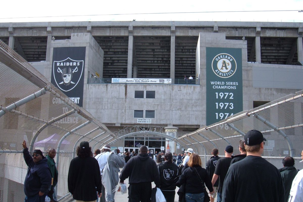
It’s no surprise that the consensus bottom-two MLB stadiums also pale by comparison from an architectural perspective. In truth, it’s not fair to compare any of the multi-purpose structures, constructed with a philosophy of flexibility and fiscal responsibility, to any of the new generation of baseball-only venues.
Heck, it’s hard to find any exterior shots of the Coliseum, in what is baseball’s most unphotogenic ballpark from the outside. There’s nothing to look at, here; no signature entrances or spaces for congregating. It’s the architectural equivalent of a frying pan.
That being said, the Oakland Coliseum’s brutalist architecture was quite well-received in its day. Round, modern, and democratic, exposed layers of concrete are sunken into the topography, with grass embankments marking the exterior scene down the lines. It made for a surprisingly intimate scale for the era, and one that is in harmony with the arena next door.
But brutalism just hasn’t aged well by today’s standards. You say, brutalism? I say fading, unadorned concrete, a complete failure of the American imagination. A faux mimicry of the great American building. A boilerplate monstrosity.
Moreover, any former appeal has been nullified by the exterior of Mount Davis, which is an unapologetically domineering concrete monstrosity from the outside, clashing with the sunken exterior landscaping of the main seating bowl.
It all adds up to a disjointed and lifeless edifice, perhaps best encapsulated by the dull, depressing concrete-and-chain-linked fence connecting BART to the stadium.
29) Tropicana Field (1990, 1998 renovation), Tampa Bay Rays: 2/10
Overall Ballpark Ranking: 26/27
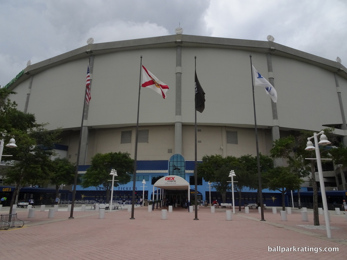
As the only stationary dome remaining in Major League Baseball, the much-maligned Tropicana Field doesn’t even have the modest architectural principles of an Oakland Coliseum. Form follows function at a place that could only be called utilitarian.
Lacking the frills of its successors, the dreary, off-white exterior façade looks like actual plastic. This could be a Walmart distribution warehouse. The only identifying feature of Tropicana Field’s underlying structure is its slanted roof design. The angled Teflon-coated fiberglass reduces interior volume in order to cut cooling costs and also protects the stadium from hurricanes.
So, why do I give the Trop a slight edge over Oakland’s exterior scene? The 1998 renovations gave the look some much needed splashes of character and color.
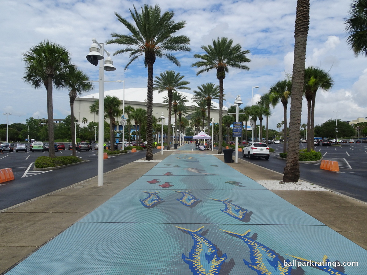
Reportedly the longest outdoor mosaic in Florida, a 1000-foot palm tree lined walkway with tiles featuring various tropical motifs gives fans a flavorful sense of arrival. The 1998 remodel also added an outdoor plaza anchored by an eight-story Ebbets Field-style rotunda. It doesn’t look like it belongs there architecturally, but the rotunda is a plus. The dome can also be lit orange.
Tropicana Field’s exterior architecture remains drab, but the scene has some nice features.
28) Rogers Centre (1989), Toronto Blue Jays: 3/10
Overall Ballpark Ranking: 25/27
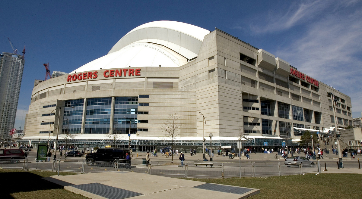
Billed as an engineering marvel due to its fully functional retractable roof, Rogers Centre (née SkyDome) opened with the pomp and circumstance of the Queen’s Jubilee.
Featuring a hotel in center field, a health club, a Hard Rock Café, a record number of luxury suites, swank club restaurants with field views, the world’s largest videoboard, and millions of dollars of art, SkyDome seemed like the mega-stadium for the 21st century.
In retrospect, SkyDome could be more aptly described as the last gasp of the utilitarian era of stadium architecture, with little use of aesthetically pleasing elements and more focus on structural functionality.
Indeed, even for all of the positive reaction upon opening in 1989, SkyDome’s exterior scene of grey concrete and blue glass was called “drab” at the time. But what else did one expect from a stadium in the 1980s?
30 years later, it’s clear that Rogers Centre shares far more in common with its multi-purpose concrete donut predecessors than any modern day post-1990 baseball-only park. Even the uglier ones are fitted with brick, stone, or steel on the outside, not unvarnished concrete.
There are a few bright spots in Toronto. On the north sides of Rogers Centre, massive gargoyle sculptures are carved into the facades in order to give the banal scene some life. Created by artist Michael Snow, 14 gargoyles depict fanatics pointing, booing, cheering, and using binoculars.
I also like how the open, bathtub-like curvature of the façade contrasts with the erect CN Tower next door, which is the world’s tallest freestanding structure. Finally, the exterior of the retractable dome can be illuminated blue at night.
Overall though, Rogers Centre’s architecture is more Oakland Coliseum or Tropicana Field than any post-1990 MLB park.
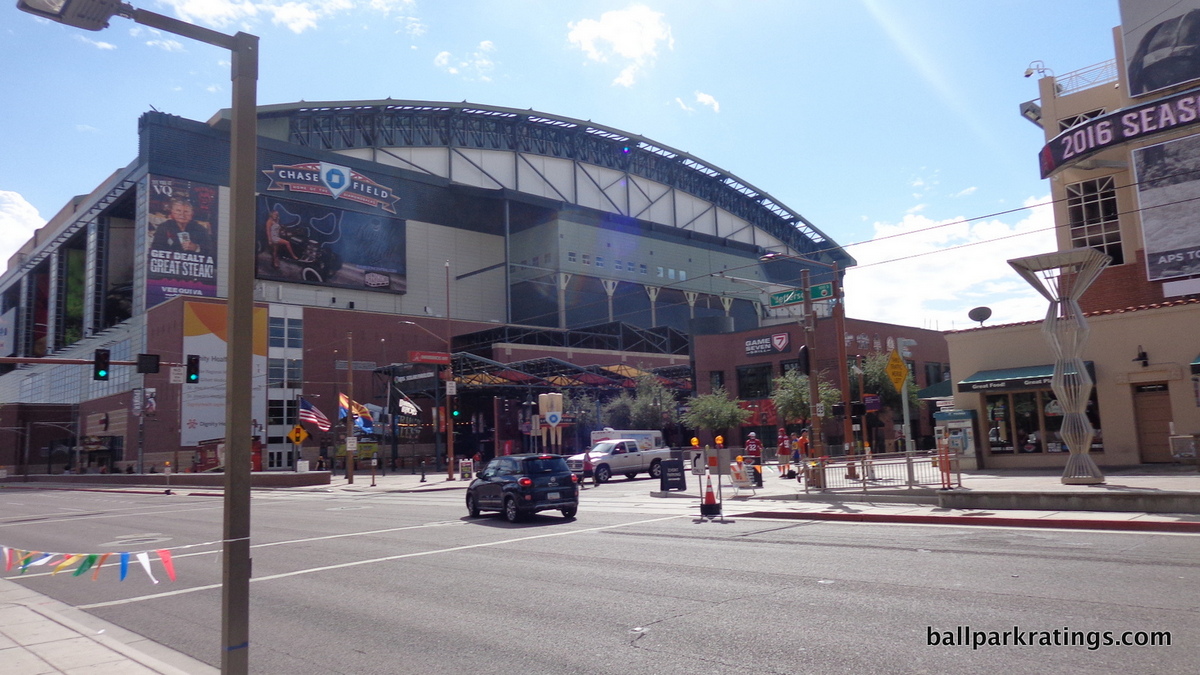
27) Chase Field (1998), Arizona Diamondbacks: 4/10
Overall Ballpark Ranking: 23/27
Chase Field hasn’t received much attention from ballpark enthusiasts, and when it does, the reaction is rarely positive. For something as tribal as a baseball team’s home, there’s a pretty wide consensus here, as Chase Field is routinely placed in the bottom-5 of Major League Baseball.
I think that’s even more clear looking at the park’s exterior architecture, in what is the least architecturally inclined or aesthetically attractive “modern-day” post-1990 ballpark.
As a retro retractable roof ballpark, Chase Field naturally suffers from the clashing architecture of its contemporaries, typifying an era where inevitably modern roofed ballparks also tried to be retro. Simply put, the two aesthetics appear mutually exclusive. These ballparks look like state-of-the-art 767s on top of brick facades.
Regardless, Chase Field’s façade looks conflicted even without the roof, with a hodgepodge of clashing elements.
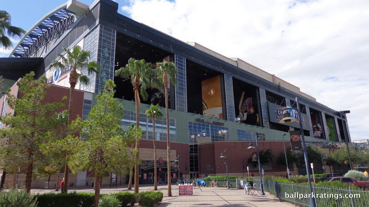
The red brick and green steel are meant to evoke the classic ballparks. The yellow sandstone represents the Phoenix southwest regional character. The geometric glass windows and sharp, clean lines look pragmatically modern. It all adds up to one of the most schizophrenic exteriors in baseball. Chase Field is a ballpark that doesn’t know what it wants to be.
Not only does the exterior fail conceptually, but it’s a rather brute, rudimentary structure, lacking the nuances of other facades.
Like Tropicana Field, the architects attached a classic rotunda to the exterior that doesn’t really look like it belongs, complicating an already muddled structure. On the plus side, the Diamondbacks added a solar pavilion in 2011 that livens up the scene somewhat.
No post-1990 ballpark is downright ugly on the outside, unlike those above, but Chase Field scores the lowest of all retro ballparks in both overall aesthetics and exterior architecture.
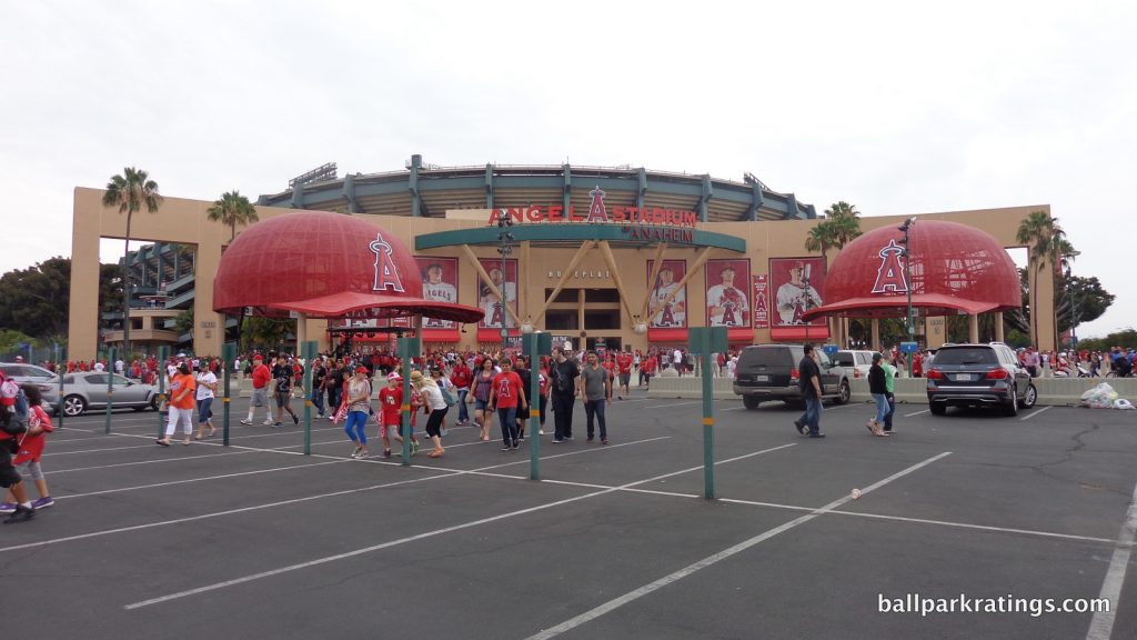
26) Angel Stadium of Anaheim (1966; 1980 and 1998 renovations), Los Angeles Angels: 4.5/10
Overall Ballpark Ranking: 24/27
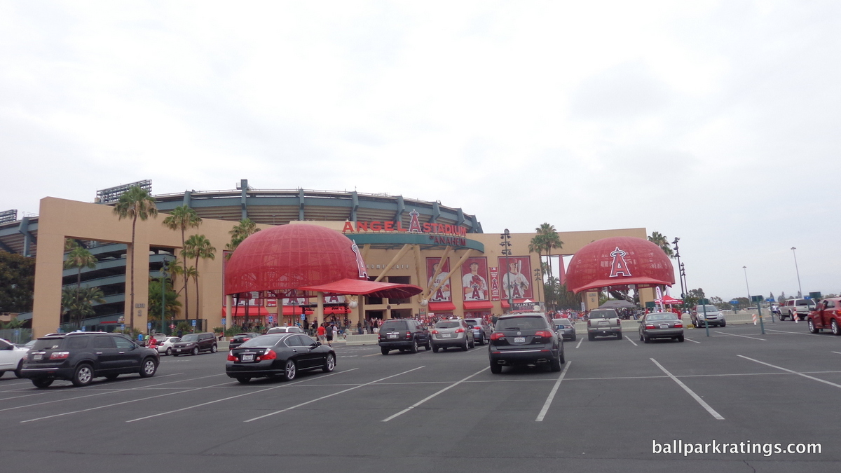
At times, Angel Stadium is conceptually adept and visually engaging, but always with little to no true architectural merit. This is despite ostensibly having an eclectic group of architects, including the famed Robert A.M. Stern.
Even a spiritless exterior design like Chase Field can claim to be more than a concrete paint job plastered with gimmicks.
The Angels insisted on calling this a “new park” when it reopened in 1998, but that’s never really been plausible, as the exterior and interior lines are still highly evocative of the old structure.
On the outside, utilitarian exposed ramps were given a heavy coat of green paint, new plazas were decorated with palm trees, and a gimmicky grand entry was added behind home plate. Angel Stadium is architecturally hollow, and transparently so, even if it’s sometimes bluntly attractive.
I can’t speak to the extent to which the grand entry façade used the bones of the original white civic-looking structure, but it certainly looks that way.
While the façade is often referred to as stucco, the fact that it’s actually light beige (or copper dust, as the architects would say) painted over concrete might partly confirm this. Regardless, any charm the facade possesses is neutralized by this aesthetic banality and architectural emptiness. Rather than the brick, stone, steel, or glass seen in even the worst retro parks, we have paint on concrete camouflaged by frivolity.
For what it’s worth, most of that frivolity (all at the grand entrance behind home plate) accomplishes the goal of making Angel Stadium an inviting and playful ballpark, which was the stated purpose of the design. More kids probably see this ballpark in person than any other MLB park (proximity to Disney Land), and they will like it. Fans are greeted with an immediate and memorable sense of arrival.
Inside and out, the “The Big A,” particularly the crowning circularity of the halo, was always Anaheim Stadium’s strongpoint. We see this theme of circularity emphasized with the new grand entry.
Flanked by two oversized Angels’ caps, the home plate façade curves outward toward the fans, subtly enhancing the already ingratiating sensibility of the design. The brick plaza in between mimics a baseball infield. Propped up by baseball bats, the ring holding up the signage resembles a semi halo.
There’s only one exterior design similar to this in its team-oriented gimmicks, and it might be instructive to contrast Angel Stadium to that much more successful one.
Comerica Park (Detroit) features a similar set of baseball bats around its grand entrance, but they are specially crafted to resemble the bats of Tiger legends, while the Angel Stadium bats look like they came out of a Louisville Slugger’s factory. Where Comerica Park has artistically sculpted Tigers added in near perfect rhythm and proportion, Angel Stadium has two brute team hats. And with Comerica Park, all of this is backed by tasteful design cues and attentive regional accents with architectural merit.
When the banality is not camouflaged by this frivolity (everywhere except around home plate) at Angel Stadium, it’s rather revealing.
While they don’t jut out as much as those at Guaranteed Rate Field (Chicago), we still have the exposed ramps of the original design. Even more transparently, the corners of the ballpark have the same utilitarian design of the original, again just covered with a coat of paint. You don’t have to look too closely to see the old stadium. The palm tree plazas help the situation, but this appearance would be unacceptable for other parks.
Overall, our criticism should be taken lightly (probably good advice for this entire piece), as this comes with the territory of renovating an older ballpark rather than constructing a new one.
Just don’t say it compares well to a new one.
25) T-Mobile Park (1999), Seattle Mariners: 4.5/10
Overall Ballpark Ranking: 11/27
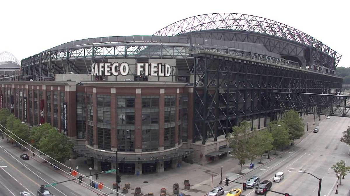
Billed as one of baseball’s greatest success stories by saving baseball in Seattle, the park formerly known as Safeco Field routinely ranks as one of the game’s greatest cathedrals, but it’s always been a bit of a conundrum for me.
While it’s a near-great park overall, I’ve always considered the Mariners’ ballpark to be the most aesthetically overrated MLB venue because of its stubbornly conflicting architecture and total lack of interior aesthetic vision.
I think that’s a less controversial sentiment when looking at the outside, as architecturally-inclined baseball fans generally agree that the exterior design is a total mess.
First off, T-Mobile Park suffers from that clashing retro retractable roof sensibility even more than its contemporaries, as the roof is jet-black. Moreover, the façade itself is completely disjointed,in what is perhaps the most incoherent stadium in North America.
Half of the ballpark emphasizes the rationalist steelwork, while the other half is wrapped in a retro facade. You can’t do both.
Considering the modern nature of the jet-black retractable roof, the Mariners should have chosen to accentuate the steel trusses of the super structure, building a decidedly modern industrial ballpark. But the Mariners instead choose to construct a brick façade behind home plate and down the third base line, with unadorned and exposed steelwork remaining on the first base side.
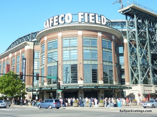
If you’re going to have a modern retractable roof that dominates the stadium, why tack on retro architecture that meekly tries to fight it? And why only on one side!? It all comes out as a painfully confused structure, as the steel trusses and roof are disproportionately scaled in comparison to the retro architecture.
When looked at alone, the metal walls and exposed steelwork that dominate the first base side are surprisingly impressive, evoking a classic structural rationalism seen in no ballpark in the majors.
But the brick wrapped third base façade is not only painfully out of place and passé, but it is not comparable to other retro exteriors in baseball.
Lacking the unique embellishments of other facades in baseball, the brickwork is characterized by a streamlined verticality that comes off as decidedly uninspiring. The vague attempt to form an arch-like look on the third base facade with the combination of glasswork is particularly primitive. Even if the Mariners had wrapped the entire structure in this red brick cloak, it would have been only slightly less disastrous.
Ultimately, the amalgam of conflicting elements makes T-Mobile Park one of the stranger-looking ballparks in the majors. People have often said that the Mariners had a mandate to build a retro ballpark, and the state-of-the-art retractable roof nullifies the classic feel.
But the truth is, the Mariners inevitably built a modern industrial steel ballpark because of its functionality, but made a weak attempt to force brick into the ballpark schema, fighting the true metallic-based aesthetic.
24) Guaranteed Rate Field (1991), Chicago White Sox: 5/10
Overall Ballpark Ranking: 21/27
Just missing the retro trend ushered in by Camden Yards (1992), people love to rip on the White Sox park (1991). While that’s not always fair, Guaranteed Rate Field definitely represents a more primitive take on the subsequent trend of warm retro facades that recall the classic jewel box parks.
Characterized by an overabundance of ramps and sterile white concrete, Guaranteed Rate Field lacks the unique architectural touches we have come to expect today. The renovations have helped a bit though.
While the modern Kauffman Stadium was cited as an inspiration for Guaranteed Rate Field, its exterior architecture also recalls that of the white washed version of Old Comiskey Park.
Infused with geometric elements of modernism, the glass arched windows successfully emulate those of the old version. Below, subtle square reliefs punctuate this theme in the cream concrete. For 1991, the bottom line was basically successful.
But as one would expect, it simply lacks the attention to detail and aesthetic attractiveness seen in the retro period. While renovations have separated them from the third base side of the façade, concrete ramps still obstruct much of the exterior.
A number of renovations have improved the exterior design. Guaranteed Rate Field replaced its old concrete canopy-style roof in favor of the exposed black steel seen in many new retro parks. A steel barrier enclosed the upper deck concourse as well, continuing efforts to make the outside feel more intimate. In recent years, green ivy has been added on the facades.
It’s a nice effort, but Guaranteed Rate Field still doesn’t compare well today.
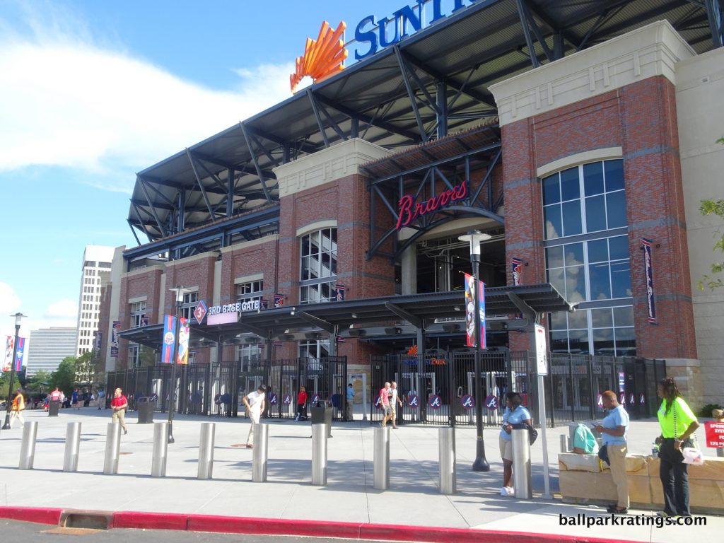
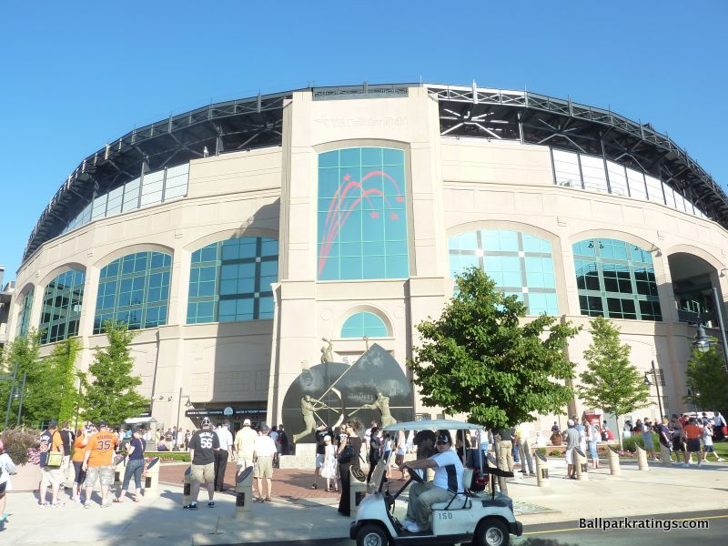
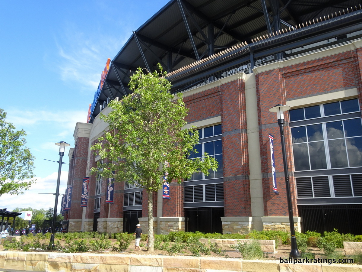
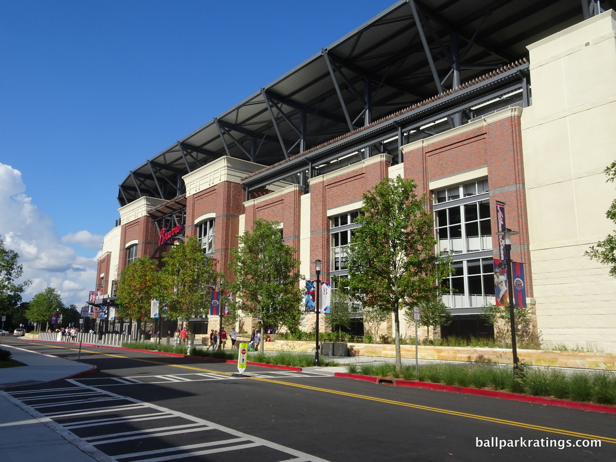
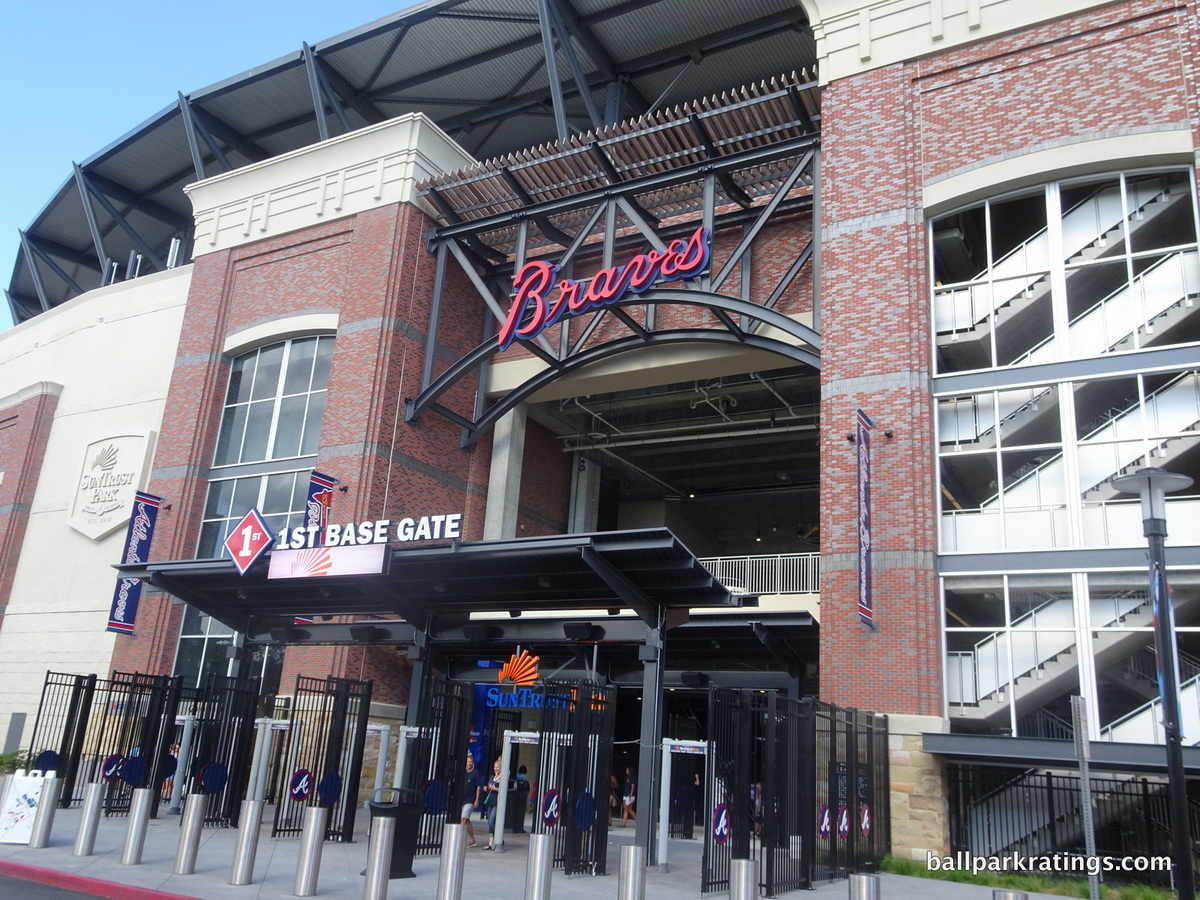
23) SunTrust Park (2017), Atlanta Braves: 5.5/10
Overall Ballpark Ranking: 9(t)/27
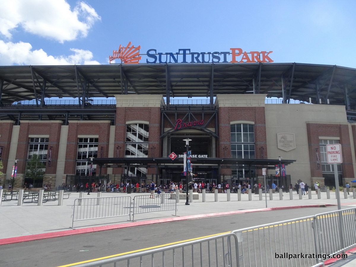
While I laud SunTrust Park’s amenities, mixed-use development, and overall functionality, it might be the biggest architectural disappointment in nearly 20 years. Because this is the newest ballpark in the MLB, I’ll be exhaustive here. The analysis will also set the stage for other ballparks below.
SunTrust Park goes back to the well of retro once again, but it doesn’t really feel like a deliberate design choice, but a generic starting point that wasn’t carried out to full fruition. SunTrust Park is the bland professionalism that characterizes Braves baseball. This is a park that was designed in a corporate boardroom.
But SunTrust Park hasn’t been referred to as “retro” too often, compared to other “retro-classic” ballparks of the 1990s and 2000s. I think this is quite illustrative. In the niche community of ballpark nerds, the term “retro” has become shorthand for derivative or formulaic, referring to an uninspired design instead of a throwback ballpark.
Well, SunTrust Park is so plainly derivative and formulaic that the word’s new meaning is beginning to strike the broader baseball fan right in the face, so the larger public has stopped using the term “retro” in the original sense when describing SunTrust Park’s design.
By 2009 with the opening of Citi Field (New York Mets), red brick had become a derided aesthetic, recycled over and over again to an exhausting degree, indicating that Populous and team officials either ran out of ideas or weren’t bold enough to try something new. Well, SunTrust Park is exceptionally lazy and banal for 2017.
First off, unless you’re recalling contextual elements or a specific landmark, a red brick design strikes me as a poor design choice given how blasé it has become. It’s not like SunTrust Park was built into an existing neighborhood of warehouses.
Constructed in a wooded area in suburbia, the Braves had free rein to design SunTrust Park however they wanted using the most imaginative architects in the United States. And they chose this.
Second of all, and what perhaps makes this most unforgivable, is that unlike the other derided (somewhat unfairly) red brick cookie cutters, there are no distinctive design cues or regional accents. There is no larger concept here. Even for retro red brick, this is lazy. It’s just red brick. I find this completely unacceptable.
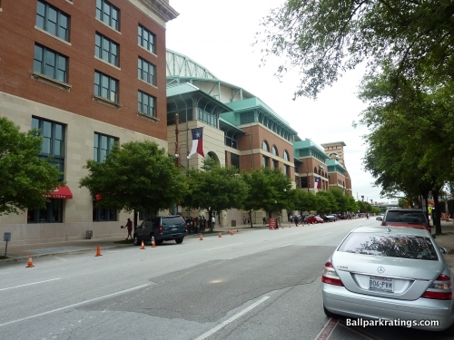
So much of baseball is about comparisons, so let’s look at some of the other retro red brick designs. At Coors Field in Denver, terra cotta columbines are added in perfect proportion, creating a distinctive southwestern rhythm. Comerica Park in Detroit features blue and orange pewabic tile native to Michigan with remarkable artistic attention to detail. Globe Life Park in Arlington is a truly epic structure, featuring subtle and artistically authentic cattle heads, lone stars, and historic Texas bas-reliefs, depicting stories of the oil boom and the Alamo.
Other red brick parks that might not fare as well as those above in exterior architecture in Philadelphia, San Francisco, Houston, St. Louis, New York, and even Milwaukee at least have some unique regional design cues and/or an overarching concept.
Camden Yards (Baltimore) might be the only one that’s similar in its lack of frills, but that was intentional. Retro itself was an original novelty for the time, so the architects understandably didn’t want to distract from that.
There’s obviously nothing novel about SunTrust Park’s exterior architecture. Nor are there any distinct regional design cues or elevated concepts.
Let’s get into the specifics, and there aren’t many. The combination of three colors of bricks is something to take note of, but I find the patterns too loud and unbecoming for a wannabe classic structure. It’s certainly a relatively distinctive pattern of masonry.
Pre-cast stone lies at the base of the façade, intended to reduce the perceptual scale of the brick above. This is a common and attractive technique seen in many other ballparks. It could be said that the concrete in between the red brick façades is unacceptably unadorned.
The Braves intended to break up the ballpark facades in order to minimize the scope and scale of the ballpark in relation to The Battery Atlanta, the mixed-use development outside.
Something similar is done in Houston, to more success, in order to break up the facades in relation to Union Station. I don’t really see it at SunTrust Park, but it is true that the right field gate doesn’t dwarf The Battery behind it. Once you get outside right field, SunTrust Park is wonderfully intimate and downscaled, in perfect relation to The Battery.
Finally, we have to address the giant canopy, which has both pluses and minuses.
On the one hand, it certainly appears to contradict the Braves’ goal of reducing the perceptual scale of the ballpark. It protrudes outward to an uncomfortable degree and takes away from what would otherwise be an intimate scene.
On the other hand, I like it! It provides a distinctive silhouette to the ballpark and lights up in red and blue at night. The distance between the canopy and the façade allows blue sky to become part of the exterior schema.
Except for the canopy, none of this is unusual, but it certainly makes the park more broadly attractive than Turner Field (the Braves’ park 1997-2016) and a handful of others across the majors. But all of these details don’t erase the complete lack of an imaginative design vision.
Look, I don’t take pleasure in bashing SunTrust Park here. Of course, it’s attractive enough, but in the way a shiny new suburban office park is attractive. Like I said in the introduction, our standards have to be higher. We taxpayers are paying for them anyway, right? Ballparks are arguably America’s last true public spaces (that aren’t malls), and we need to aspire for the best.
In sum, SunTrust Park lacks the originality, elevated concepts, or distinctive regional design cues seen in most other post-1990 ballparks, all while using an exterior treatment that is remarkably unfashionable for its time.
As I wrote in the long-form piece reviewing all of SunTrust Park, maybe this signals architecture simply no longer matters, as the “commercial era” of ballpark construction is now in full force, where almost everything is all about amenities and functionality with little attention to original design flares.
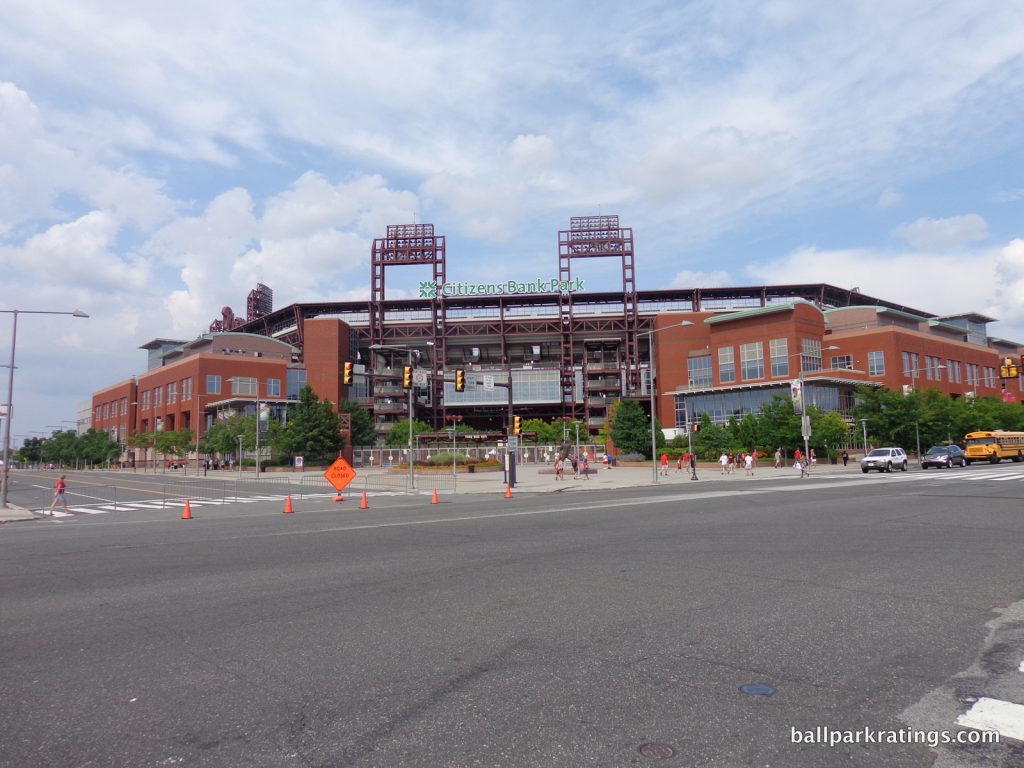
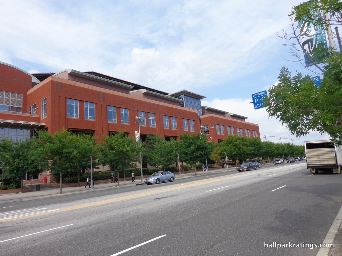
22) Citizens Bank Park (2004), Philadelphia Phillies: 5.5/10
Overall Ballpark Ranking: 13(t)/27
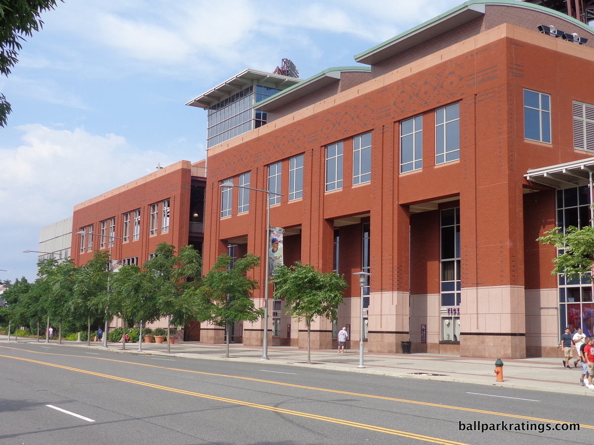
While the conceptual effort is laudable, Citizens Bank Park’s exterior design is more defined by its location outside of the city center than it would like, without the originality or raw aesthetic appeal to compensate.
However well-executed any piece of exterior architecture might be in theory, it’s difficult not to end up with something rather prosaic when dropped in a 15,000-car parking lot.
Formulaic red brick exterior designs may seem more acceptable when they are tangibly adapting to borders and resemble the local context, while those in the middle of nowhere can sometimes verge on intolerable in their mundanity. Even a venue like Nationals Park fits in well with its surroundings.
Couple that with uninspired architectural treatment on its own, and Citizens Bank Park is among the weakest red brick retro ballparks.
Let’s first look at the concept. The architects’ vision was to design the layout of Citizens Bank Park as if it was constrained by urban borders.
Philadelphia’s City Hall, which is situated among Washington, Rittenhouse, Logan, and Franklin squares downtown, was said to be the model. William Penn’s city plan, metaphorically representing four points of entry, was the explicit inspiration for creating a ballpark that looked like it was part of a city.
With those four spacious entry plazas, Citizens Bank Park looks like it’s in a square urban block. All four sides of the building are occupied by activity, as if there were city buildings next door.
The intention is admirable, but it just doesn’t work. If you have a suburban location, don’t design an urban building. A ballpark’s interplay with its context is just too important. If you are going to go this route, perhaps it’s not self-contained enough, lacking a true mixed-use community to provide the intended faux urban sensation, as the sense of phoniness is inescapable. But at least the Phillies have a clever conceptual vision, unlike SunTrust Park.
Perhaps this was an instance were retro impulses should have been checked. The suburban Globe Life Park (1994) in Arlington has a similar sense of phoniness, as if it’s on “Rangers’ baseball theme park island,” but it compensates with a pioneering retro look and a strikingly attractive appearance, filled with nuanced regional accents.
For all its lack of place and derivative stylization, Citizens Bank Park also has the intensity of a suburban office park, not an architectural monument meant to celebrate America’s great game. In an era where ballparks are defined by signature entrances giving fans an immediate and memorable sense of arrival, Citizens Bank Park fails to make a strong opening statement.
While effective retro ballparks in Denver, Arlington, and even Detroit are supplemented with unique but architecturally sound regional accents, Citizens Bank Park is the architectural equivalent of off-brand ripped jeans.
The base of the red brick columns receives polished pink granite treatment, but it looks too manufactured and smooth. Parts of the exterior facade look like the headquarters of an insurance company, while other parts almost have an abandoned Philadelphia warehouse motif.
Overall, I think the structure is awfully brute and corporate. It’s subtle, but the red brick itself is finished on prefab panels, without the semblance of being personally laid brick.
For me, the fact that “PHILADELPHIA” is spelled out in black bricks across the second story of the façade says it all. Because of the underlying similarity of retro red brick treatment, many parks try to add accented brick and distinctive design cues, but usually with at least some architectural merit.
Citizens Bank Park just says “PHILADELPHIA” in bricks! Subtle. It basically tells me the architects knew retro was banal by 2004, realized they had to superficially distinguish their red brick, and completely ran out of ideas on how to do that. Surely, they could have been more tasteful than that.
Can you imagine “BALTIMORE” or “COLORADO” inscribed outside of Camden Yards or Coors Field? Both sides of Citizens Bank Park’s façade also have black bricks forming a series of generic baseball diamonds.
All of this underscores the stage-set sensibility of the entire picture.
Citizens Bank Park isn’t totally bereft of merits. The landscaping around the structure is attractive. The maroon wrought iron is a nice change of pace from the usual green we see around the majors, and fits well with the red brick. It’s more industrial chic. And the Philly Phanatic sign behind the left field scoreboard adds some much-needed whim to the office space-like structure.
Overall, Citizens Bank Park’s concept doesn’t work in the suburban setting, and it lacks the imagination or attractiveness to overcome that.
21) Miller Park (2001), Milwaukee Brewers: 5.5/10
Overall Ballpark Ranking: 22/27
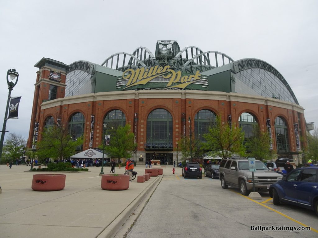
Well, at least the Brewers can say this: out of all of the retro ballparks constructed in America, their retro ballpark may be one of the most identifiable landmarks of their city.
With its massive exterior archways and gaudy steel trusses, Miller Park sticks out like the Taj Mahal in the Greater Milwaukee landscape, an unmistakable civic icon for Milwaukee and an engineering marvel.
But just because it is an engineering wonder, that doesn’t necessarily make it an architectural one.
That being said, I still think Miller Park is slightly underrated as a building, just not as a ballpark. It is pretty fashionable to attack Miller Park as an obtuse or awkward structure, but it has a certain structural integrity in its curvature both inside and out.
Perhaps the most controversial exterior design in baseball, many folks claim that Miller Park’s façade sticks out like a sore thumb among a sea of suburban parking spots, or that the roof resembles a deformed tarantula.
First discounting any criticism of the execution, I must admit that the red brick façade seems especially inappropriate here. From an architectural point of view, Milwaukee is generally known as the “Cream City” for its light-colored clay brick, much of which is derived from the local area and Lake Michigan. But early on in the design stages, the Brewers demanded an Ebbets Field-inspired exterior façade. A use of local materials would have been a much better fit.
Not only is the exterior a poor choice for the location, but it is also a poor choice when fused with an overwhelmingly large, high-tech retractable roof.
The Brewers continued to embody the stubborn retro insistence on combining modern technology with nostalgia. A modern treatment would have also made much more sense, especially in suburbia. And yet we have retro red brick.
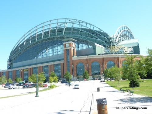
But Miller Park does many things right on the outside. It still looks incongruous and a bit awkward, but I like how the wrought iron is more of a light faded green, evoking more of a worn, classic appeal that fits the nostalgic treatment. The tension between the roof and the retro architecture is still apparent, but it’s not nearly as bad as T-Mobile Park or Chase Field.
The brick itself is fairly ordinary, characterized by an unusual amount of glass highlighted by the green iron, but it is slightly more coherent than the other retractable roof ballparks mentioned.
The majestic arches behind home plate serve as the focal point for the inward converging steel trusses of the fan shaped retractable roof. While a bit top heavy, the glass retractable structure itself is quite a marvel. Unlike the other ballparks, the Brewers emphasize structural presence rather than intimacy, and that’s pretty unique.
The giant glass archways of the roof are nicely juxtaposed with the vertical glasswork beneath. The two glass roof arches successfully combine a nostalgic concept with modern application.
Unlike retractable roofs in Seattle, Houston, and Phoenix, its ugly mechanisms are hidden inward as well, stressing Miller Park’s aesthetics.
However, as with every covered facility, its roof is disproportionately prominent on the outside compared to the superstructure. On the whole, it’s better than T-Mobile and Chase and presents an iconic civic image, but as you can see by the score, that isn’t saying much.
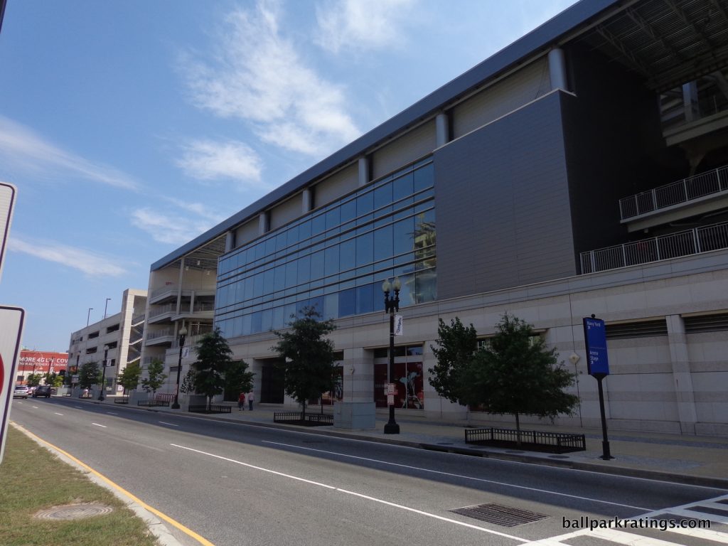
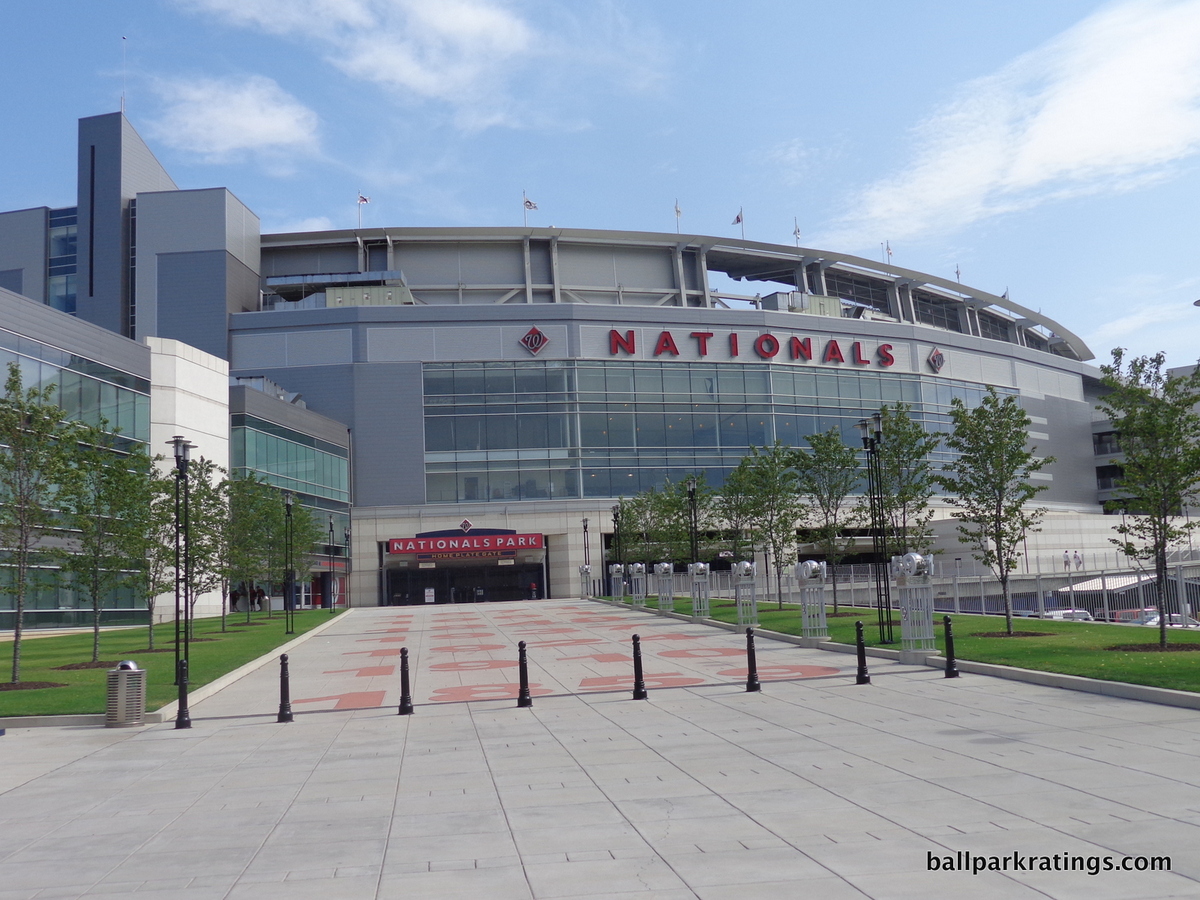
20) Nationals Park (2008), Washington Nationals: 6/10
Overall Ballpark Ranking: 12/27
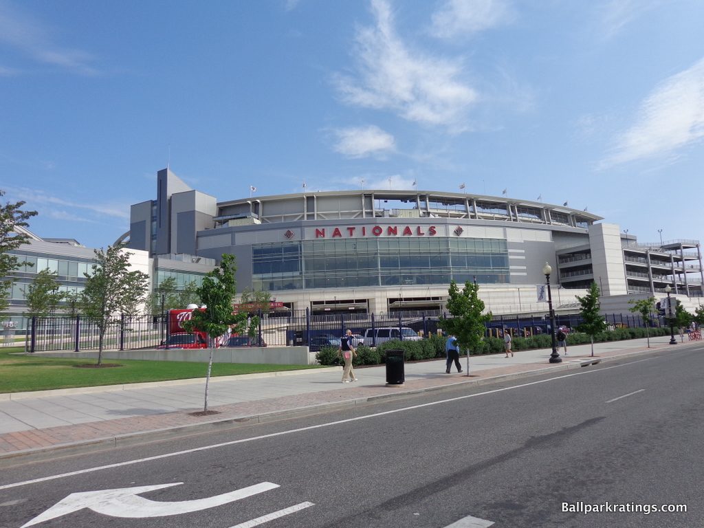
For a structure apparently inspired by I.M. Pei’s East Wing of the National Gallery of Art, Nationals Park’s exterior façade comes off as unapologetically mundane, with all of the pomp and grandiosity of a suburban office park.
While Nationals Park so plainly falls short of the national monument we might expect, I do believe the design has its merits. Not only is it a welcome departure from Populous’s passé red-brick retro architecture, but the aesthetic fits in wonderfully with the urban D.C. context.
But lacking the structural presence to elicit an immediate and memorable sense of arrival while eschewing the use of high-quality materials seen in other non-red brick ballparks, Nationals Park fails resoundingly by traditional architectural metrics.
Let’s get into the details, starting with the park’s pure architectural merits.
Intended to echo the traditions of Washington’s best civic buildings, Nationals Park uses translucent glass, steel, and pre-cast concrete in an effort to reflect the ethos of the city’s monuments. Quite noticeably, the rather heavy pre-cast concrete is painted to look like limestone. Nationals Park was originally rendered in limestone, but limestone was eliminated in order to cut costs. I.M. Pei would not approve.
The resulting effect is a building that looks more dull and bland than iconic and modern, resembling the Verizon Center instead of a nearby architectural monument. It most reminds me of a generic Arts and Science building on one of the hundreds of university campuses across the United States. Nationals Park is simply streamlined glass and painted concrete, devoid of any of the unique regional accents commonly seen in other MLB parks.
The standards for MLB ballpark architecture are inexcusably low, but this is not the norm. Looking at those that don’t feature red brick, PNC Park (Pittsburgh) features rugged Kasota stone, Yankee Stadium has granite quarried from Maine and limestone from Indiana, and Petco Park (San Diego) imported ochre limestone from India. More resembling the White Sox derided 1991 park than anything else, Nationals Park’s use of mediocre materials is unacceptable.
Moving on, there are two other rather crucial design aspects that could have been improved.
Nationals Park’s signature entrance that possesses the qualities described is behind home plate, but the vast majority of fans enter through the center field gates. The center field entryway is unremarkable, flanked by two bland parking garages. Reminiscent of the Braves’ former home, Turner Field, most fans aren’t going to see the façade. If you loved the glassed entryway behind home plate, you likely won’t see it.
Moreover, the home plate entrance isn’t particularly inviting. Approaching from the South Capitol Street bridge, note that underground parking takes up the majority of the space around the signature entrance. Unless you go toward the walkway leading to the home plate gate, you can’t walk right up to the façade.
With the flurry of new development, this would have been a great place to put a garden or some street-level development. Perhaps the cold façade would look a little more palatable if the team did this.
So, what saves Nationals Park from scoring at Angel Stadium painted concrete levels?
Along with just not being retro, frankly, Nationals Park fits in wonderfully with Washington’s landscape and is in proper scale with its surrounding environs. The more I think about it, the fact that Nationals Park “fades into the landscape” is more of an asset than a deficit.
Think of Chicago and Boston. You could make the argument that Wrigley and Fenway are the most recognizable and historic buildings in town. That was never going to be the case with Nationals Park in Washington D.C., and, would you really want that to be the case?
Nationals Park doesn’t make the assertion of being D.C.’s next historic monument, nor should it. The building showcases a design that is compatible with the national memorials, not one that stands out among them. Washington D.C. possesses an order of tones that are grey and neutral (and maybe even dull), and Nationals Park is grey, neutral, and dull. A “civic-looking” building isn’t necessarily going to be warm and attractive.
Nationals Park really fits with its physical plant as well. Note how the southern end of the site is sharply angled by Potomac Avenue and South Capitol Street. The architects adroitly used this space to create a sharp façade that fits with the edge of the intersection. Linear forms slide through the curvature of the façade. I’m generally not a fan of the weird, unprincipled quasi-deconstructivist style Populous sometimes employs, but I thought this was clever.
Regardless of architectural merits, I think there’s something to be said for building a structure in unison with its context. More attractive exteriors in Arlington, Miami, and New York can’t say that.
Overall, Nationals Park isn’t particularly serious in its architecture. Its crude use of materials and assembly-line looks aren’t going to inspire anyone, but it is very D.C. and presents a welcome departure from the ubiquitous retro designs.
19) Great American Ballpark (2003), Cincinnati Reds: 6/10
Overall Ballpark Ranking: 19(t)/27
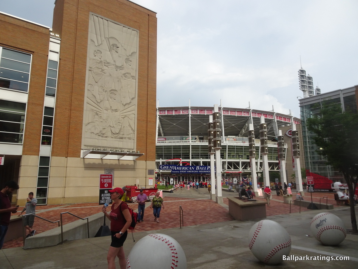
Out of all current MLB parks, Great American Ballpark’s exterior is the most difficult for me to characterize, mostly because it seems so conceptually disjointed, similar to the inside.
Great American Ballpark’s exterior seating bowl (inner façade) embraces an industrial theme with exposed glass and white steel echoing Ohio, abstractly similar to Cleveland’s park. But the inner façade is connected to “outbuildings” that utilize an interesting mix of Midwestern Art Deco and International Style, despite being faced with the most generic orange bricks imaginable.
There’s a lot to like here, but when looked at together, the aggregation comes off as rather haphazard and aggressive, lacking consistency in proportion and use of materials. While it’s not as bad as the inside, Great American Ballpark looks like it tried to do too many things and please too many different people.
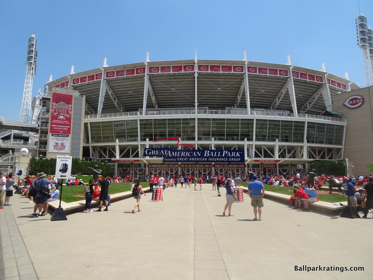
The industrial design of the inner façade, seen where the ballpark’s exterior signage is located behind home plate, utilizes a rather monotonous order of transparent glass and white steel.
It’s too structurally heavy for my taste, as I think the similar concept in Cleveland is more aesthetically pleasing. The lack of variation looks drab. The precast concrete towers flanking the main entrance also looks bland. Finally, the metallic look fails to connect with the riverside setting, unlike the architecture of other waterside parks in San Francisco and Pittsburgh.
Crosley Terrace, sitting outside the main entrance in between the inner industrial façade and the outer brick buildings, is a lovely supplementary touch to the design. With grass sloped to match the exact grade of old Crosley Field’s outfield incline, this is a nice counterpoint to the heavy glass and steel of the industrial facade.
Fitted with orange brick, precast masonry, scrim panels, and glass walls, the architecture of the outer buildings is intended to reflect the International Style of Cincinnati in the 20s and 30s. Also echoing the base of the Roebling Bridge that crosses the Ohio River, you have to admire the contextual inspiration and the use of a calculated architectural style here. While these outbuildings don’t have a lot of popular aesthetic appeal, this comes close to “capital A” architecture.
Regardless, the outbuildings are not properly integrated with the glass and steel façade of the main structure, as it seems like the Reds tried have both retro International Style structures and a forward-looking industrial design. The entire look comes off as disjoined in the aggregate. I also don’t find the outbuildings very aesthetically appealing, either.
Great American Ballpark’s tour de force is its gorgeous Art Deco limestone relief on the facing of the International Style façade on the home plate side.
Called the “Spirit of Baseball,” the 50-foot-tall bas relief depicting ball players was inspired by Cincinnati’s Art Deco heritage in the 30s and 40s, especially the military recruiting artwork of WWII. Constructed using the same Indiana limestone seen across the city, most notably on the Cincinnati Museum Center at Union Terminal, this is one of the very best exterior elements in Major League Baseball.
In sum, Great American Ballpark’s elevated concepts, contextually-inspired focal points, and tremendous Art Deco bas relief often give me the impulse to rank this exterior design even higher. But the overall look is an odd combination that is simply too disjointed when taken together, while also lacking the raw aesthetic appeal to compensate.
18) Kauffman Stadium (1973, 2009 renovation), Kansas City Royals: 6/10
Overall Ballpark Ranking: 15(t)/27
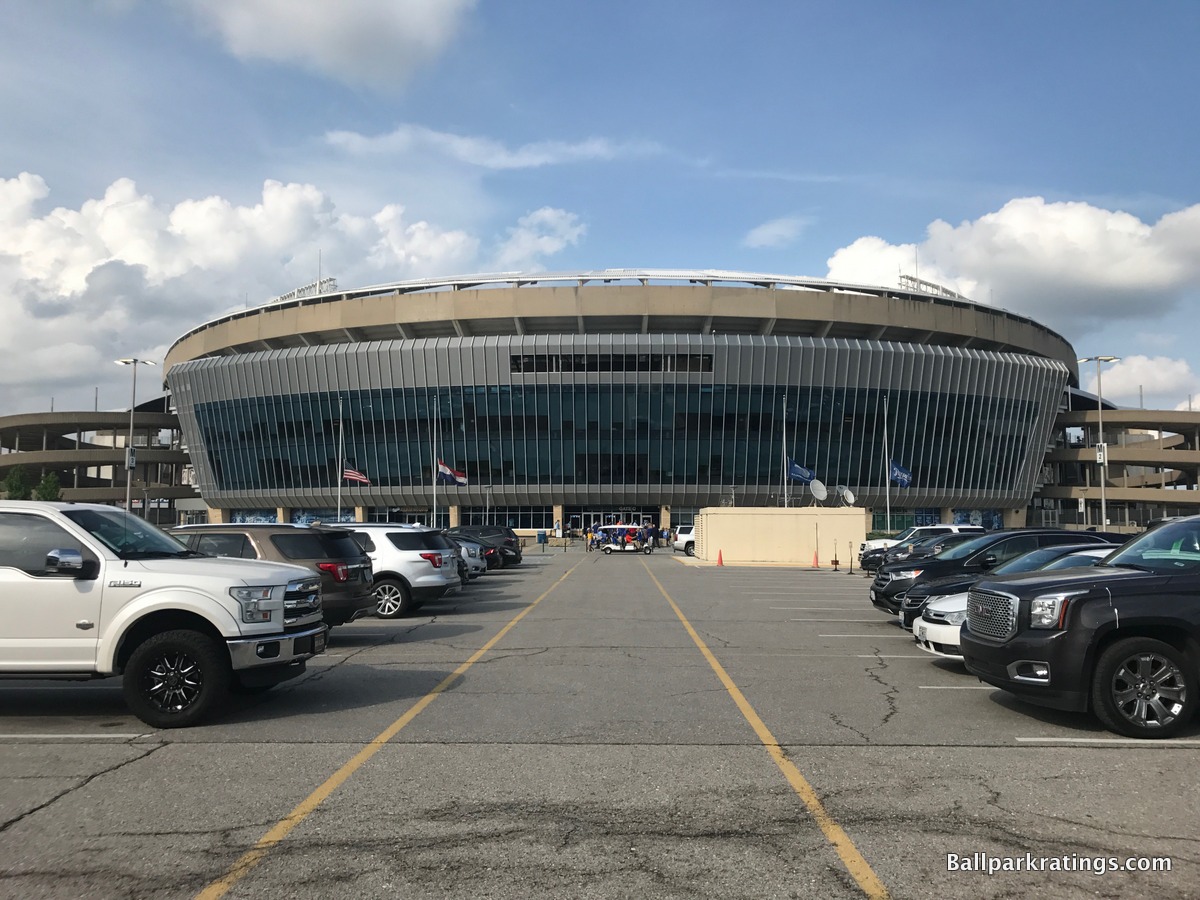
Considered one of the two staples of modern ballpark design, the pre-renovated Kauffman Stadium was perhaps the only ballpark that could ever be interpreted as sculptural in design.
Sure, the unadorned concrete didn’t (and doesn’t) have a lot of aesthetic appeal by today’s standards, but the curvature of the concrete facings and razor-sharp tapering of the upper deck looked organic and beautiful.
The heavy structural elements flowed together and were perfectly juxtaposed with the light, airy nature of the fountains inside, totally eschewing the ornamentation and kitschy retro theming that became all the rage among the post-1990 ballparks.
Just like the interior aesthetics of Kauffman Stadium, I believe a lot of that modernist exterior architectural appeal has been nullified by the 2009 renovations.
The sharp lines are still there, but much of that former simplicity is overpowered by mediocre veneers.
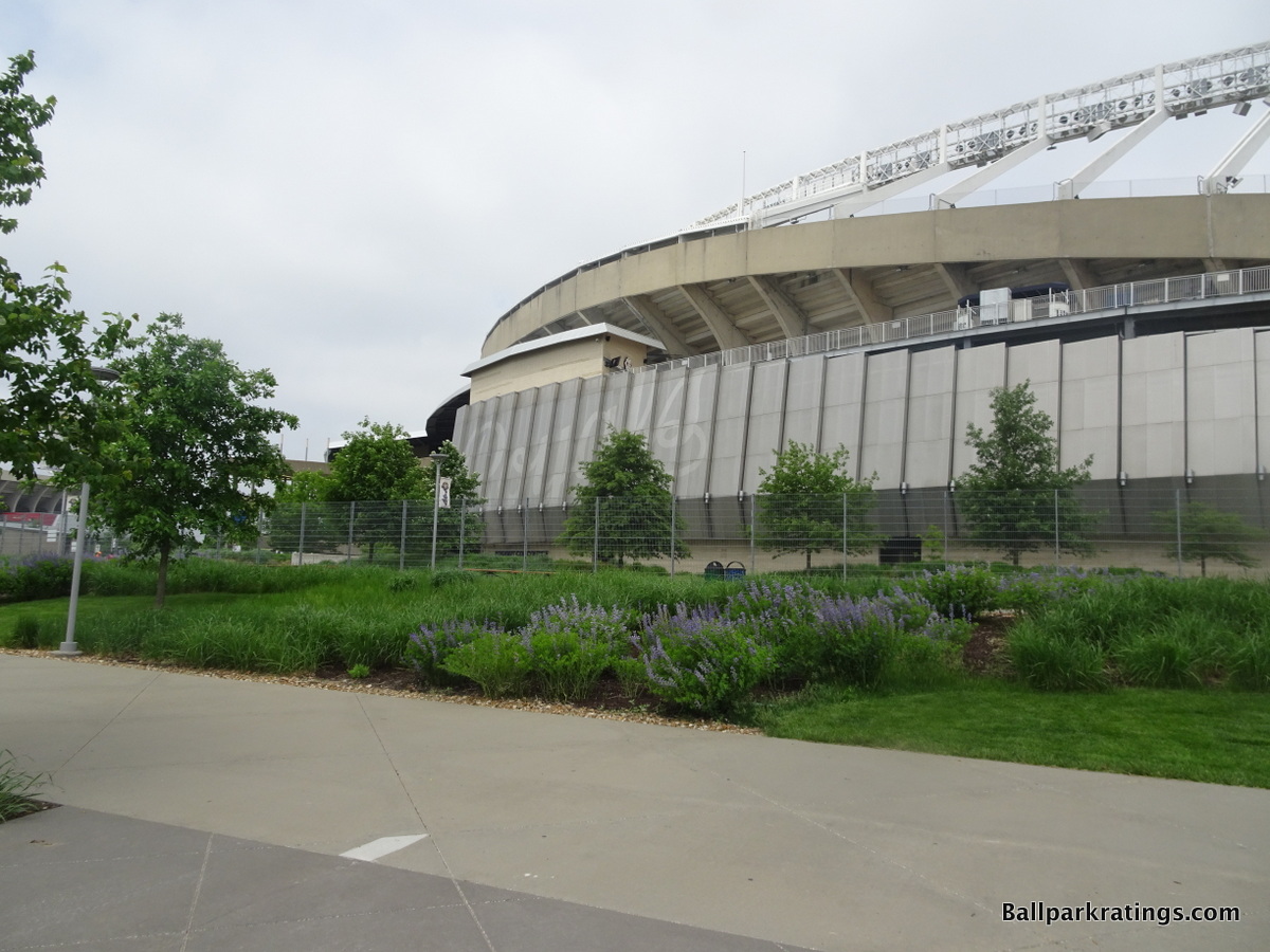
The oversized, glassed-in exterior entryway behind home plate overwhelms the simplicity of Kauffman Stadium’s underlying intimate curvature. For a style that loathes ornamentation, the grey, metallic facades emblazed with “ROYALS” letters seem totally out of place and heavy handed. The entire look is now too muddled.
On the other hand, I’m somewhat thankful that the Royals didn’t go even further in that direction, as I’m sure there was pressure to pull an Angel Stadium and go overboard with gimmicks and overtly thematic embellishments. There was talk of a grand “crown entrance” with gaudy coronets, model bats, and other phony baseball theming, much like that of Angel Stadium. Thankfully, we don’t have that.
As it stands now, at least Kauffman Stadium isn’t littered with postmodern gimmicks, even if the old look has been muddied by these veneers. The sleek architectural lines mostly remain salient. As an added bonus, the new landscaping with purple flowers is pretty.
While my gut aesthetic impression would place this exterior in the bottom-10, I still give Kauffman Stadium a bit of a boost because of its modern heritage, although I wish the appearance hadn’t been altered at all.
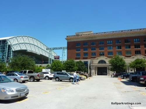
17) Minute Maid Park (2000), Houston Astros: 6.5/10
Overall Ballpark Ranking: 15(t)/27
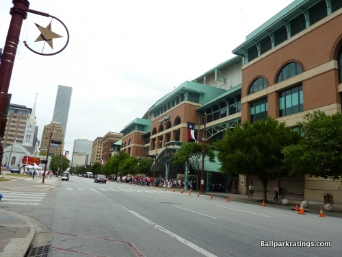
With authentic contextual inspiration and elevated concepts, Minute Maid Park is one of those rare structures that I really appreciate in the abstract, even if it doesn’t look that good.
In terms of appearance and pure architectural merits, the outside is probably one of the worst in the majors, with too many thematic elements and an ugly bathtub-like appearance.
But at the same time, unlike retractable roof ballparks in Seattle, Arizona, and Milwaukee, Minute Maid Park’s exterior design is very well articulated in its architecture, without the conflicting modern ethos we see in those three ballparks.
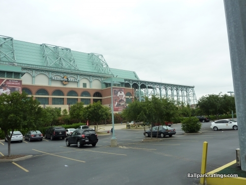
It’s the only “retro” retractable roof ballpark that successfully managed to build a “retro” roof as well, in what looks remarkably coherent and well thought out.
The park’s architectural design is reframed around the Houston’s classic downtown Union Station (old train station), built in a Victorian neighborhood in 1911. Minute Maid Park takes that contextual element’s authentic architecture and applies it to the ballpark.
The warm red brick of Minute Maid Park is typical, but its façade is nicely accentuated by granite, limestone, and other masonry, all of which are also prevalent in the area. The round archways relate not only to Union Station but also to the Annunciation Church next door.
Specifically note how the exterior façade is broken up into small, disconnected structures to better match the scale of intimate Union Station. The exterior applies, integrates, and mimics the sensibility of the urban fabric quite well. Fantastic.
But what is clearly the most audacious exhibition is the retro style of the retractable roof on top of the retro-classic building. In Houston, we have a roof that reinforces and maybe even enhances the style of the building.
Architects examined classic train sheds for inspiration, using elegant lacy ironwork. The coherent Minute Maid Park has a turquoise beamed retractable roof, evoking the faded lacy ironwork of turn-of-the-century train sheds, in direct connection to Union Station. The turquoise color is meant to represent the faded copper of train tracks.
Because the roof’s superstructure received this contextually based treatment, Minute Maid Park looks like a giant retractable train station, in what is one of the most conceptually successful retro ballparks in the majors.
Like Marlins Park is an unmistakable contemporary ballpark, Minute Maid Park is an unmistakably retro one, unlike the more confused Miller Park, Chase Field, and T-Mobile Park.
Some of the supplementary elements reinforce the turn-of-the-century train motif as well. The turquoise retractable roof supports are arched, mimicking the brick arched façade below. Although, like with most retractable roof ballparks, it suffers from a number of awkward areas for the roof mechanisms.
The arched turquoise home plate/left field entrances are vaguely reminiscent of European facilities, but are meant to represent a classic train station waiting area. The home plate clock tower is very attractive as well.
Of course, while Minute Maid Park carried out its design goals to perfection, in what is “all about trains and baseball,” the general consensus is that it doesn’t look that good from the outside. There is a growing backlash against conspicuously thematic and hokey ballparks like Minute Maid Park. I’m inclined to agree.
As a piece of architecture, when you turn your ballpark into a theme park with no new ideas, there is a low ceiling on its merits, in what is a heavy-handed attempt to evoke the past. But that’s something most retro parks suffer from.
Overall, I think Minute Maid Park gets some immunity because it is so consistently well executed. As a concept, the contextually influenced Minute Maid Park is admirably ambitious on the outside, despite its basic aesthetic limitations.
16) Citi Field (2009), New York Mets: 6.5/10
Overall Ballpark Ranking: 18/27
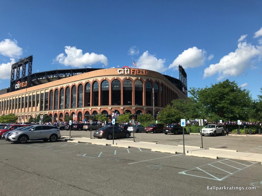
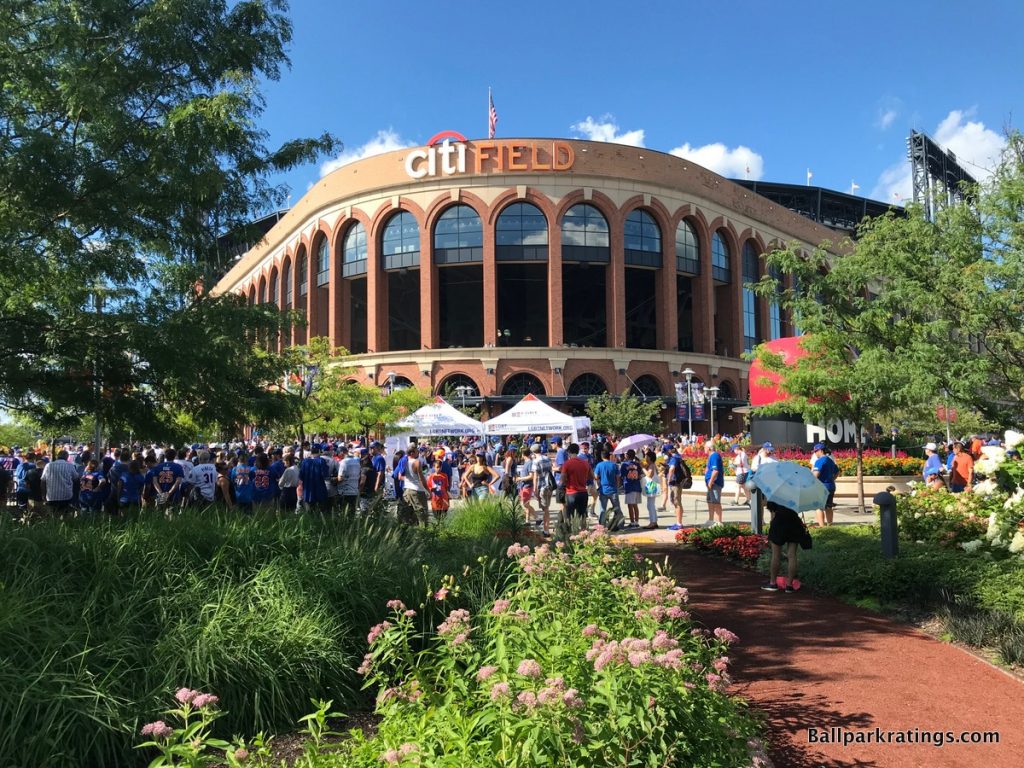
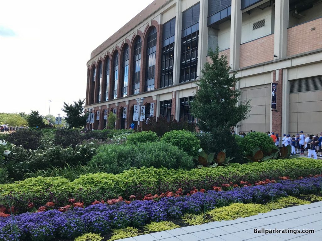
Adorned with classic red brick archways and a grand rotunda evoking Brooklyn’s Ebbets Field, Citi Field possesses one of the more discussed and recognizable exterior designs in baseball. Paying homage to one of the greatest ballparks of all time, Citi Field’s venerable architecture yearns to exude warmth and a simpler time.
Indeed, New York’s facsimile has a lot of popular aesthetic appeal, as it’s a more broadly attractive building than as many as 20 other current MLB parks, hence my generous placement at #16, but put me in the camp that tends to view Citi Field’s imitation more negatively.
To put it in a nutshell, Citi Field’s retro architecture comes off as hackneyed and stilted, totally ignorant of its temporal or locational context, while simultaneously lacking the nuances or attention to detail of other historic or current day facades.
After a generation of Ye Olde ballpark designs, retro treatment had become decidedly overdone by 2009. During the time period from Camden Yards (1992) to the opening of Citi Field (2009), 11 red brick rip-offs were introduced to the MLB ballpark scene, in addition to/including 5-6 ballparks with Ebbets Field-inspired rotundas.
In the mid-2000s, we began to see some modest departures in superficial treatment, with parks in Pittsburgh, Cincinnati, San Diego, and Washington, D.C. adding a modicum of variation. But Citi Field went right back to the well.
My very first impression of Citi Field was that it looks like a ballpark conceived in 1999 that opened in 2009, and if you look at the ballpark’s history, there’s a lot of truth to that. Fred Wilpon (team owner) was always obsessed with building an Ebbets Field facsimile, and he was going to build it whenever and wherever he could.
We had just seen this formula too many times by this point. The red brick, the wrought iron, the Ebbets-style rotunda. We get it. The Mets still could have built a great “retro” ballpark in the late 2000s, but it’s much more difficult, because the aesthetic initially comes off as tired and cliché.
The recycling of old styles without any forward-looking concepts was always a sticking point of the retro era, but it’s especially problematic at Citi Field, which is overwhelmingly formulaic and derivative on its face.
Citi Field is a timeless ballpark built right when that style of ballpark ran out of time, one of the final red brick cookie cutters.
Second of all, Citi Field’s red brick design simply lacks the modulation and attentiveness of Ebbets Field or even some other retro designs. For a style that loves ornamentation and regional accents, Citi Field’s assemblage of red brick, granite, and limestone looks rather plain.
While Ebbets Field’s archways were accentuated with pilasters, gargoyles, bas reliefs, and exceedingly charming Federal-style windows, Citi Field has a streamlined verticality that looks assembly-line produced. For such a billing, I don’t see a lot of time and effort put into the design here.
In addition, Citi’s exterior looks a bit jumbled because the red brick archways aren’t extended down the lines, so the façade abruptly turns into a sequence of unadorned square openings. The outfield exterior is also horribly muddled with ads.
I’ll finally add that the exterior scaling does not match the intimacy evoked by the nostalgic treatment, as the main concourse is not at street level (with the field below street level, like at most parks, even Yankee Stadium), so the façade towers a bit too much over the scene. Although, I do like how the smaller base of arches below the larger brick archway help reduce the perceptual scale.
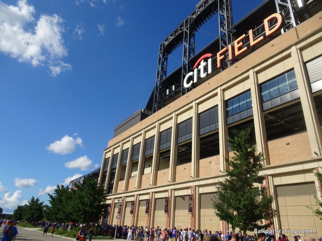
Don’t get me wrong—sure, this is a reasonably appealing building, and I like some elements of the design, most notably the airy lighting at night—but it’s not particularly outstanding when looked at solely on its own architectural merits, regardless of other complaints.
Third, and perhaps most importantly in my book, even if this was an outstanding throwback design, such a style absolutely does not belong in a parking lot in Queens.
Citi Field is another faux-urban ballpark without an urban setting, totally ignorant of its context, but it’s even worse here because the Mets’ horrendous local scene actively fights the classic sensibility.
Ebbets Field was in part so charming because it was shoehorned into a venerable neighborhood, structurally integrated with a Brooklyn community. As I’ve stated many times, this is the key to great classic and retro ballparks alike. Citi Field is dropped from the sky into a parking lot surrounded by ugly repair shops, scrap yards, and waste processing plants. There’s simply no local inspiration for such a retro design.
Citi Field is yet another classic baseball theme park on an island, conveying a stage-set sensibility fitting of Broadway, but that island isn’t surrounded by suburbia per usual, but the valley of ashes in the Great Gatsby.
Finally, not only does the architectural style not fit with the neighborhood, but it also doesn’t seem particularly fitting of the grand architectural traditions of New York City. Call me crazy, but the New York Metropolitans should have a metropolitan design!
Honestly, it wasn’t really incumbent on the Yankees to build something forward-thinking, as the intention was to emulate the classic Yankee Stadium I. The Mets could have constructed something novel and lasting, fitting with the former architectural capital of the world. Instead, we have a pastiche of the Brooklyn Dodgers’ old park for a different franchise.
A city that brought us Frank Lloyd Wright’s Guggenheim was well-equipped to bring us the next innovative ballpark, with plenty of sources of inspiration.
New York City had and has an extraordinary amount of differentiation in its tradition, ranging from Beaux Arts (Penn Station, Grand Central, etc.), Gothic (American Radiator), and Art Deco (Chrysler, Daily News, Empire State, etc.), to Mid-Century Modernism (Manufacture’s Trust Company), Sculptural Modernism (UN), and Postmodernism (2 Columbus Circle).
Yes, Citi Field’s exterior treatment is uninspired for the time period, but the irony is the Mets were uniquely suited to bring baseball out of that nostalgic architectural funk, and they totally punted. A missed opportunity to say the least, one of the few times where it explicitly made sense for a team to eschew red brick McMansion architecture.
In sum, Citi Field is attractive enough, but the Mets’ choice of architectural materials was poor given the time, neighborhood, and city. Moreover, without the charm or majesty that should be inherent in its usage, Citi Field is not a faithful representation of Ebbets Field anyway, lacking the tasteful accents or urban integration that made the old park special.
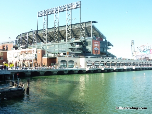
15) Oracle Park (2000), San Francisco: 6.5/10
Overall Ballpark Ranking: 2/27
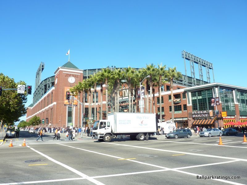
Instead of echoing the eclectic cornucopia of famous historic and modern architecture of San Francisco, the Giants choose to wrap an exciting ballpark in an urbane brick cloak, lacking many of the accents seen on other facades across the majors.
In my opinion, this is another retro architectural design that simply doesn’t fit with the spirit of the city. In addition, even for retro architecture, Oracle Park lacks much of the expected striking qualities, unlike some similar predecessors.
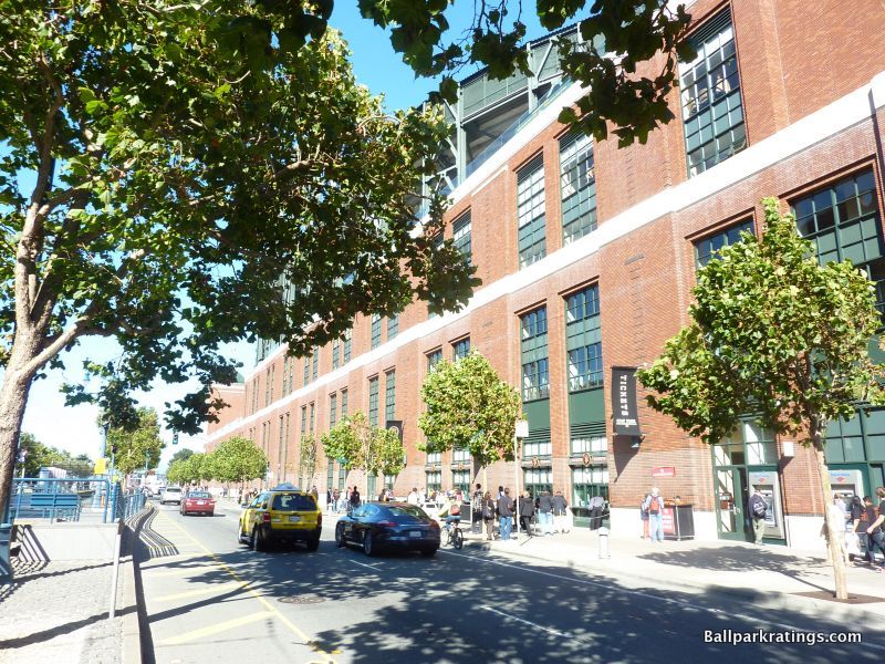
Like SunTrust Park in Atlanta, the façade itself is rather plain and derivative, lacking much to distinguish it from a regular brick building. I guess the light red brick, with an almost orangish hue, is appropriate because it vaguely mirrors the Giants’ primary color.
Because the field is at street level (thus, not sunk in like other ballparks), the structure isn’t as intimate as others, especially since the upper deck seems to disproportionately tower over the structure below.
However, one nice subtle touch is the vertical array of black bricks in between the dual sets of windows, meant to represent the stitching on a baseball.
While not representing San Francisco, Oracle Park does deserve credit for reflecting the urban industrial buildings of the South Beach neighborhood. The façade of brick panels and square glass windows mimic the area perfectly, however generic. While the design doesn’t reflect both the larger area’s architecture and the neighborhood like a Nationals Park, it does at least reflect the neighborhood. Like St. Louis below, it splits criteria #2.
Moving onto some of the supplementary elements, the Willie Mays Plaza behind home plate has become the iconic exterior image of Oracle Park. Decorated with palm trees, it is a great area for fans to congregate before the game. The trees are wrapped in orange lights at night. Don’t forget to check out the cream-colored exterior façade by the water.
While the setup is nice enough on the whole, Oracle Park has one of the safer exterior designs in baseball. Don’t get me wrong: we’re getting into the upper half here, so there’s no doubt that Oracle Park’s exterior scene is attractive and relatively well done.
It just doesn’t match Oracle’s brilliant bayside interior aesthetics, or some of the other retro exterior architecture across baseball.
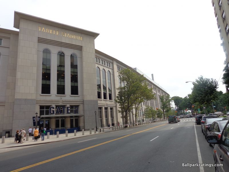
14) Yankee Stadium (2009), New York Yankees: 7/10
Overall Ballpark Ranking: 9(t)/27
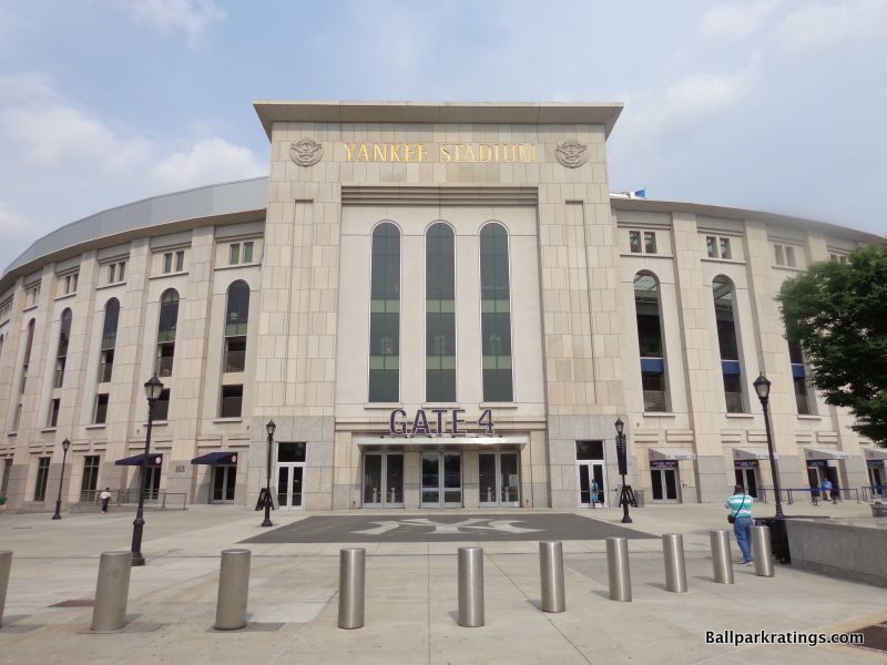
Fitted with imposing tones of limestone, granite, and pre-cast stone, the palatial Versailles on the Harlem River shares few superficial similarities to the warm Citi Field across town, but both suffer from the same underlying problems.
Citi Field and Yankee Stadium (both opening in 2009) are aesthetically attractive enough, but both are self-contained, backward-looking homages to classic ballparks without the architectural prowess or nuances of the original.
However, unlike in Queens, it wouldn’t have made any sense for the Yankees to build an architecturally ground-breaking venue, as emulating the pre-renovated old stadium (Yankee Stadium I, 1923-1973) that sparked memories of World Series championships made far more sense. The totally justifiable design goal was explicit: recreate the 1920s cathedral. So independent of the mixed results, I give Yankee Stadium a pass on the derivation that I certainly do not give to Citi Field.
For that reason, along with the fact that (a) Yankee Stadium utilizes slightly higher quality materials, (b) it fits in a tad better with its context (a low bar), and (c) any departure from red brick is welcome at this point, I give Yankee Stadium the slight edge.
Given that old Yankee Stadium was one of the most famous stadiums in America, it’s fitting that the new version strives to inspire the awe of the Roman Coliseum, perhaps the most famous stadium in the world.
Characterized by towering verticality, the narrow and monotonous archways consist of grey limestone imported from Indiana. The Deer Isle lavender granite at the base of the façade is quarried from Maine. Most of the archways, except for those fronting the open-air Great Hall, are enclosed by transparent glass.
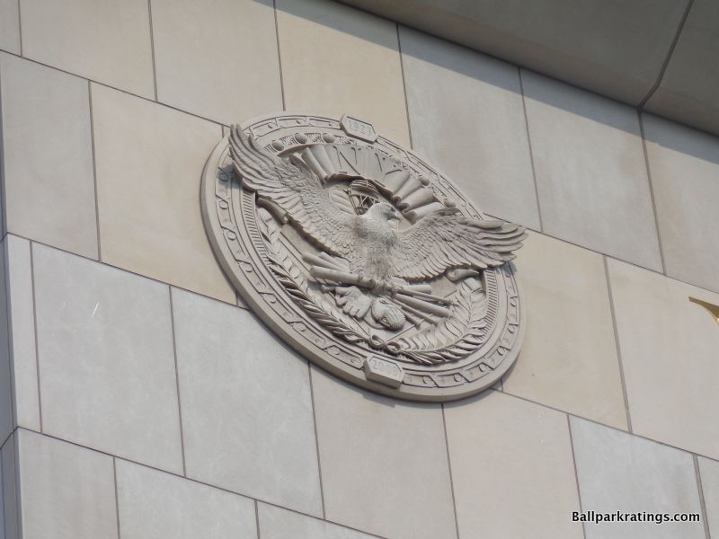
The stadium’s name is V-cut and gold lettered at the top of the entryways, perhaps evoking a decline-of-the-Gilded Age-vibe ironically fitting with the throws of the Great Recession. Old Yankee Stadium is most explicitly recalled through the 7-foot, 4-inch decorative eagle medallions flanking the gold lettering above the entryways.
Yankee Stadium’s exterior could be interpreted as austere and aloof rather than grand and majestic, but I like that there’s absolutely nothing tacky or stage-set about it, unlike a harsh take on the theme park in Queens.
That being said, something is still a little bit off about new Yankee Stadium compared to the classic version.
Yankee Stadium’s limestone face makes for a manufactured magnificence that feels just a bit too pristine. The gilt-lettering engraved into the façade is just a bit too golden. The eagle roundels are just a bit too immaculate. It’s all too streamlined. The crisp rhythm and narrowness of the archways aren’t an earnest simulation of the more authentically monumental and boxy facade of the original.
The underlying appearance is very similar, but the tune is a little off, because new Yankee Stadium is lacking the structural presence or attention to detail of the original.
The most overlooked flaw of new Yankee Stadium’s exterior is the lack of an upper level exterior façade. Whereas old Yankee Stadium continued its stone façade on the upper deck above the main façade, a white plastic-looking balustrade sits above the new version’s limestone.
The white balustrade, unmistakably new Yankee Stadium’s cheapest exterior feature, clashes with the limestone below and makes the ballpark look unfinished. The Yankees should have continued the façade by putting some masonry above, or perhaps repeating the frieze present inside the park on the exterior, but this plastic-looking balustrade protrudes upward like a sore thumb. How a billion-dollar ballpark messed this up is a mystery.
Looking beyond the park’s architectural merits in a vacuum, Yankee Stadium’s contextual relationship with the neighborhood is mixed, but far better than the insular Citi Field.
More imposing than anything else in the Bronx neighborhood, Yankee Stadium seems to have little connection to the ochre-toned apartment buildings surrounding it at first glance. At the same time, the decades-old permanence of both the Jerome Avenue Art Deco tenements and the scrappy bars and shops on River Avenue create the allusion that Yankee Stadium grows out of its urban setting.
Moreover, the plaza built on River Avenue toward the elevated train tracks really enhances Yankee Stadium’s connection to its urban environment. The superficial tone of the stadium’s façade loosely matches that of the surrounding buildings as well.
The local inspiration for the materials at Yankee Stadium is conceptually solid, even if it does sound like a stretch in practice.
Yankee Stadium’s limestone, quarried in Oolitic, Indiana, came from the same spot where the limestone panels used for the Empire State Building were cultivated. Yankee Stadium’s granite, originating from the Crotch Island quarry outside of Stonington, Maine, came from the same spot where granite was quarried for the Rockefeller Center and the George Washington Bridge.
Explicit nods like this at least show me that the team and the architects are reaching for something organic and contextually inspired, which I think is pretty cool.
In sum, Yankee Stadium isn’t a truly faithful recreation of the original, lacking the structural intensity or more authentic contextual relationship with its environs. But it cracks the upper half of our exterior architectural rankings by creating an iconic image fitting of the New York Yankees and utilizing relatively novel and high-quality materials, caveats aside.
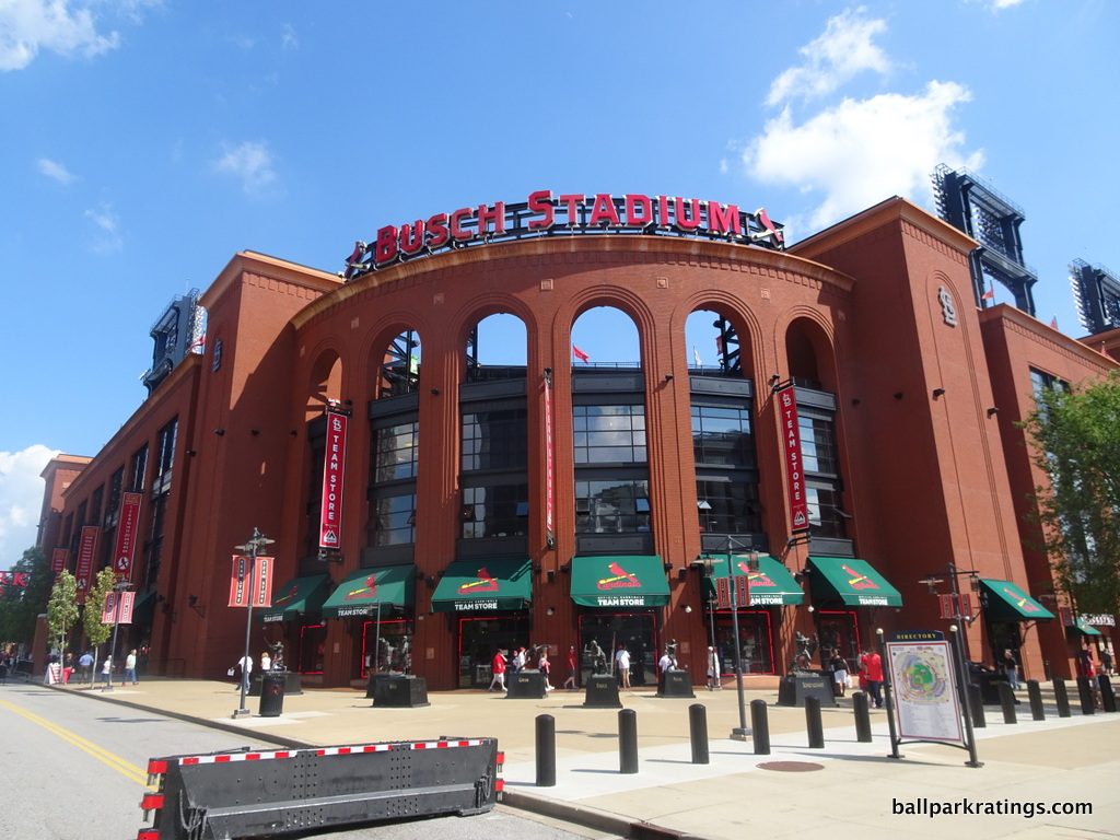
13) Busch Stadium (2006), St. Louis Cardinals: 7/10
Overall Ballpark Ranking: 13(t)/27
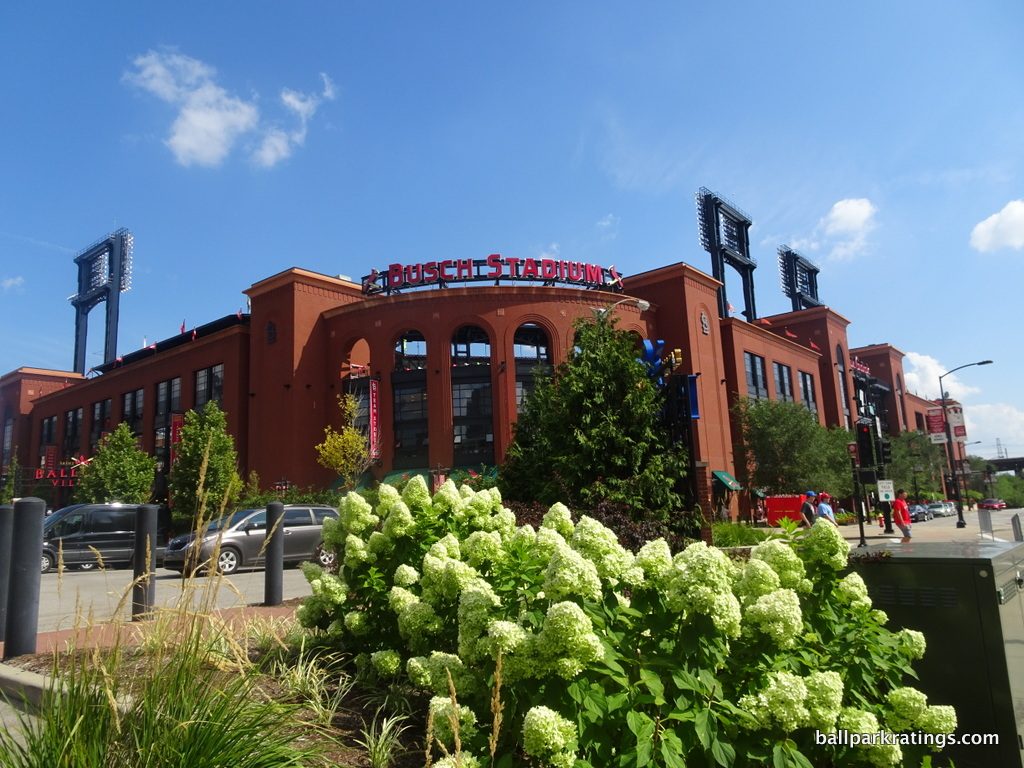
Once again going back to the tired formula of red brick and wrought iron right when the style was becoming unfashionable, Busch Stadium has often been characterized as the “ultimate retro cookie cutter” by ballpark enthusiasts.
On a superficial level, Busch Stadium shares a lot of similarities with Citi Field by returning to a passé design after the country had seen enough of this style and by building a ballpark out of touch with the progressive architectural image of the city.
That being said, I’ve (somewhat grudgingly, to be honest) concluded that Busch Stadium’s façade is pretty well done. The exterior architecture (a) utilizes locally-inspired concepts, (b) is adorned with wonderful regional accents, (c) fits in with the surrounding urban buildings, and (d) is pretty darn gorgeous on a raw aesthetic basis.
From the outset, I do think it’s important to illustrate why the Cardinals should have gone contemporary, embracing the progressive image of the Gateway Arch. From the spirit of the 1904 World’s Fair to the Arch, St. Louis has always been a city of ambition that looked to the future with its architecture.
While Populous also cited the forward-looking Wainwright Building (one of America’s early skyscrapers) and the Eads Bridge along with more classic structures as inspiration for Busch Stadium, that entirely misses the point.
Paying proper homage to those two progressive structures does not mean mimicking their superficial style, but embracing their spirit of abandoning templates and forging something new. It meant challenging dominant styles of the time, and indeed, there was no more dominant style than the retro ballpark in the 1990s and early 2000s.
Ironically, the nostalgic trend in American ballparks was winding down by the late 2000s, so Busch looks like a missed opportunity anyway. It’s no surprise that Populous’s chief architect on the project, Jim Chibnall, actually wanted to go modern, but the Cardinals gave him a mandate to design the ballpark in a traditional style.
For what Busch Stadium is on the outside—a retro cookie cutter—it is at least a pretty good one.
While not eclipsing more nuanced retro facades in Denver or Arlington, Busch Stadium’s red brick consists of darker hues, distinguishing the exterior from its peers and fitting with the Cardinals’ color scheme. The exposed steel trusses are black as well, rather than the usual green. If I had to nitpick, the exterior doesn’t seem quite as intimate as some of the better ones, as it really looms over the setting.
While Busch Stadium doesn’t reflect the overarching sensibility of the city, the façade is infused with plenty of regional accents and mimics the urban landscape very well. The overall appearance of the exterior façade is strongly influenced by the Cupples Warehouses a couple of blocks away.
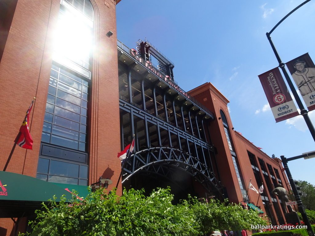
Most notably, the gorgeous entry at Gate 3 is embellished with a sprawling arched black steel piece directly recalling the iconic Eads Bridge, which crosses the Mississippi River into Illinois. Dubbed the Stan Musial Bridge, Busch Stadium’s most iconic exterior element pays tribute to one of the most important bridges in the world.
There are plenty of neat Cardinals touches adorning the exterior, including small ornithologically-correct birds and personalized bricks. The ornamental terra cotta panels on the main façade recall the famous Merchants Building, considered the Wall Street of the Midwest in St. Louis’s heyday.
Overall, Busch Stadium possesses a handsome façade with plenty of locally-inspired elements that fit in with the urban area. But looking to the past wasn’t the right move given the city or the time period in the mid-2000s.
12) Dodger Stadium (1962), Los Angeles Dodgers: N/A
Overall Ballpark Ranking: N/A
Carved into the hillside of Chavez Ravine, longtime ballpark trekkers may be surprised to see Dodger Stadium this high on the list because it doesn’t really have much of a traditional “façade.” As with all three current day classic parks, it’s very difficult to compare them to the modern-day post-1990 venues, but that is especially true of Dodger Stadium’s exterior scene.
While there’s obviously far more to write home about when looking at the interior aesthetics, Dodger Stadium is mid-century modern (MCM) ballpark architecture at its finest on the outside as well, and all of the 21stcentury renovations have been in keeping with that tradition.
You see it in the inverted roof canopies, the unadorned concrete, the light blue pastel hue of the few visible facades, the topiaries at the terraced entrances, and even the urn-shaped planters.
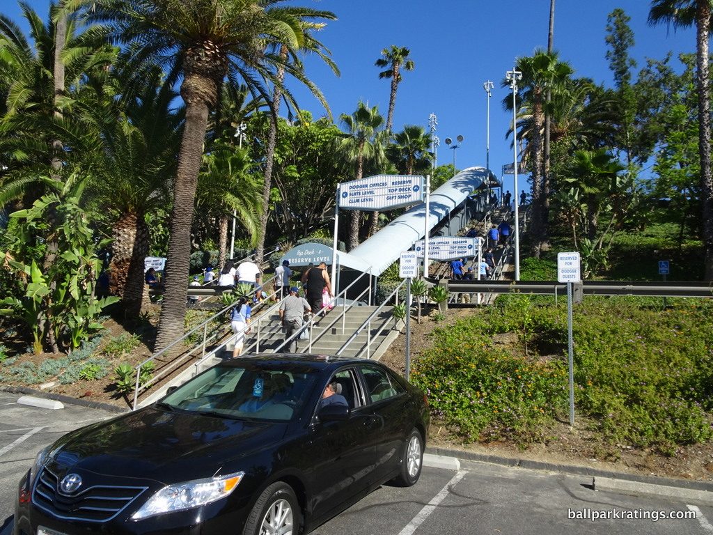
But the greatest hallmark of MCM architecture is how it can blur the lines between architecture and topography, and Dodger Stadium is primarily defined by a wholescale reshaping of the land.
As Dodger Stadium officials will tell you, bulldozers literally moved mountains to build this place. The team carved the terraced seating bowl into what was called Mount Lookout, and filled in the ravines to create parking lots. The complex topography of the site was shaped to look like a baseball glove.
It was an engineering feat of construction, with 8 million cubic yards of earth removed, the equivalent of 2 Los Angeles City Halls. This layout allowed each tiered terrace around the ballpark’s ascending exterior to be accessible by car, with no need to climb staircases or ramps to get to your seat.
With most of the exterior sunken into the ground, New York-based architect Emil Praeger intended for clean roof lines and gorgeous landscaping to set the scene, not brute architectural prowess. Periodic renovations have further emphasized the landscaping, building new pedestrian plazas with layers of drought resistant palms, plants, and flowers. It’s no surprise that the Dodgers are the only team to employ a full-time arborist!
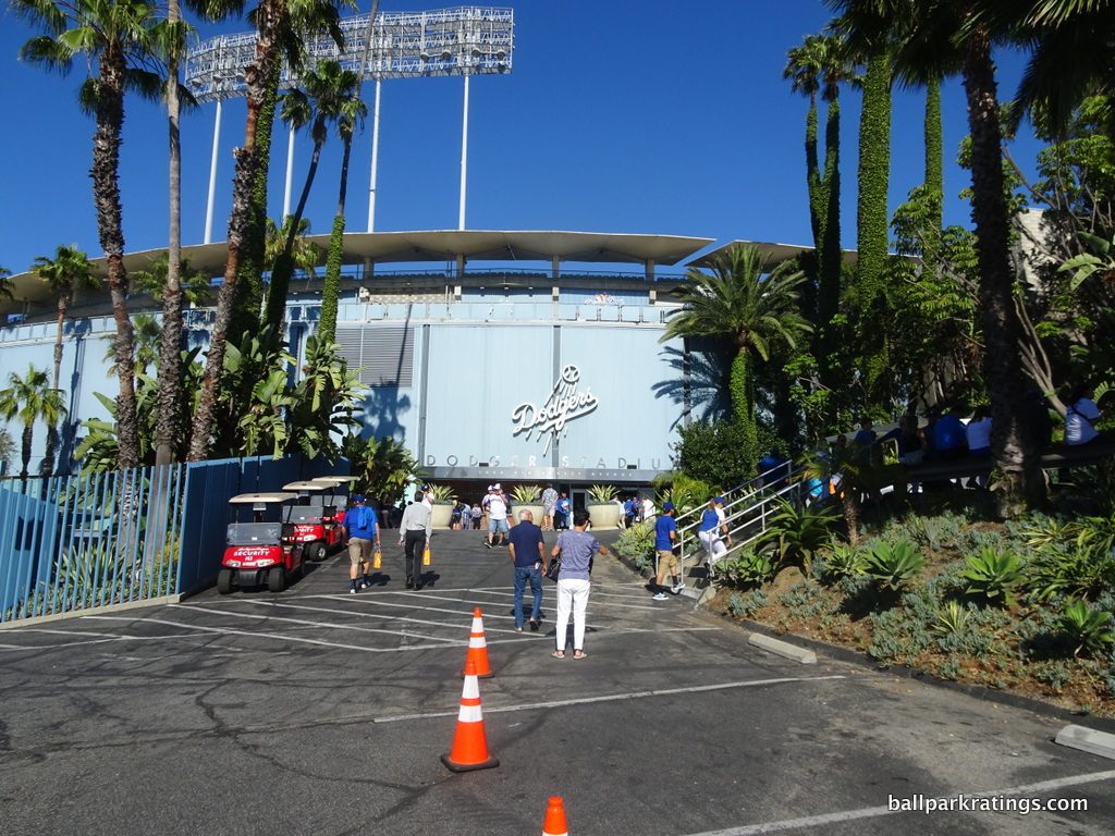
Unlike today’s excess, Dodger Stadium works through complementing the game being played, not overpowering it. New parks attempt to be unique by having kitschy ornamentation, mainly because the underlying treatment is more or less the same.
Emphasizing enduring structural assets over attention-grabbing gimmicks or contrived quirks, Dodger Stadium is the ideal combination of light (zigzag folded roof line above the pavilions) and heavy (concrete grandstand superstructure). Don’t take the ranking at #12 too seriously with Dodger Stadium, as it is simply really hard to compare.
The exterior scene is clean, beautiful, and groundbreaking, baseball’s only true MCM structure to echo the city’s landscape and achieve a higher aesthetic purpose.
11) Comerica Park (2000), Detroit Tigers: 7/10
Overall Ballpark Ranking: 4/27
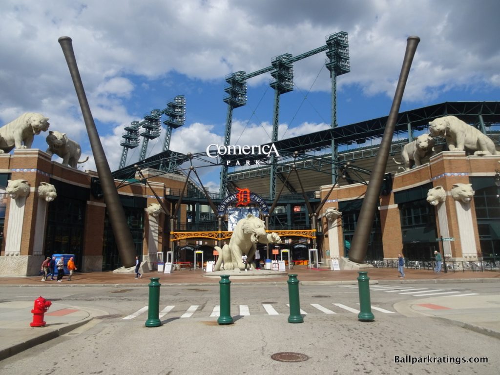
Defined by numerous tiger sculptures and other artistic elements, I vacillate back and forth on how to assess Comerica Park’s rather controversial exterior scene, but I ultimately come out with something that is above average.
On the one hand, it’s a bit much, as you could perhaps argue that some true architectural merit is sacrificed. Traditionally, this is the type of overtly thematic architecture I dislike.
On the other hand, there is not another ballpark in baseball where so much time, money, and effort was spent on beautifying the exterior architectural scene. Arguably over-the-top in its extravagance, but nicely juxtaposed with the simplicity of the interior aesthetics, Comerica Park is notable for the dozens of enlarged tiger sculptures surrounding its retro red brick.
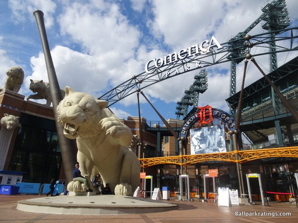
Despite fair accusations of being too thematic, I don’t think it’s appropriate to call these tacky gimmicks. Once you see the Tiger statues, you’ll realize these are real artistic sculptures.
In fact, you could argue no other ballpark has more “art” on the outside than Comerica. There are many of these creatures, and they are added in perfect proportion and rhythm. If you hate corporate naming rights, just think how “Comerica” slowly but surely gets undercut: This is Tiger Stadium.
The massive bats are modeled after the bats of different Tigers legends. Other various accents help as well, such as the tiger gargoyles on the walls. Take note of the tiger claw marks running down the white columns beneath with gargoyle heads. Throughout the design, we see blue and orange pewabic tile, a material native to Michigan. We have remarkable artistic attention to detail for a ballpark.
Comerica Park is also a remarkably intimate building on the outside, possibly to a fault. Due to the sprawling design and the use of only two decks, the exterior appears sunken into the ground to the extent that the ballpark looks like a regular two-story building. It really fits in well with Detroit’s urban landscape.
Surrounding “outbuildings” make up the façade, which are partially separated from the main seating bowl. The concept can be seen as a precursor to the design of Great American Ballpark and Petco Park. It certainly shows the architects were coming up with new, innovative ideas at the time, something that doesn’t seem true in ballpark design today.
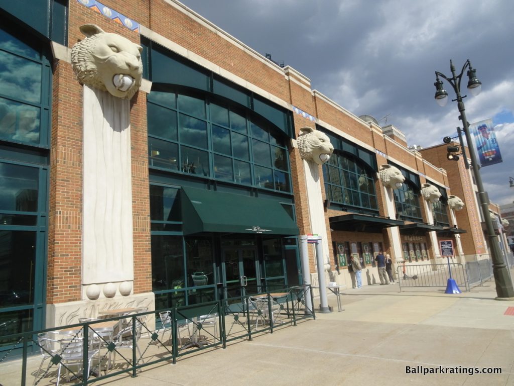
The Tigers went for the understated look, where the façade itself doesn’t attempt to overshadow the baseball experience, not considering the supplementary Tiger sculptures.
Despite suffering from especially architecturally unremarkable red brick, perhaps intentionally, a lot of attention was put into Comerica Park’s exterior scene, despite reasonable accusations of being too hokey, defined by gaudy baseball theming. These aspects prevent me from giving it an even higher score.
But at times, I get the impulse to grade this as one of the best ballpark exteriors in baseball, because of (a) the high level of intimacy and fit with the area, (b) the sheer time, money, and effort put into the design, and (c) my subjective affinity for the overall appearance.
10) Wrigley Field (1914), Chicago Cubs: N/A
Overall Ballpark Ranking: N/A
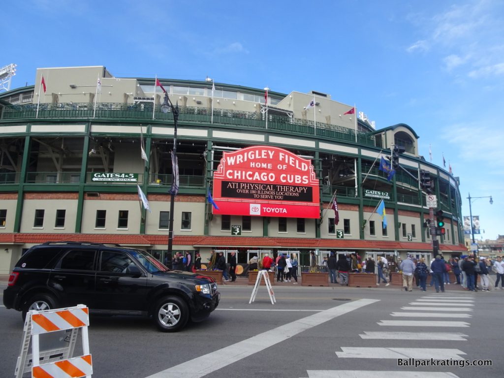
Now affectionately known as The Friendly Confines, Wrigley Field really shows that it matters more how ballparks evolve than how they are built.
In the 1910s, Shibe Park, Comiskey Park, and Forbes Field were regarded as the irreplaceable greatest parks of the era, as Wrigley Field was overshadowed by other more expensive and grandiose “jewel box” parks. Even a place like Ebbets Field benefited from an accumulation of lore into the mid-20th century.
This was especially true of Wrigley Field’s exterior architecture, which was originally eclipsed by more civically-minded classic parks, including that of baseball’s only remaining jewel box venue, Fenway Park. Compared to the ornate Shibe Park, cast in cartouches and terra cotta with a French Renaissance design, Wrigley Field’s exterior design was rather understated.
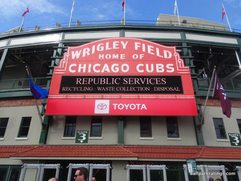
Arguably the greatest exterior landmark in all of Major League Baseball, the Art Deco-style marquee was installed in 1934. In fact, it was blue. The marquee was later painted red in the 1960s. But during the mid 20th century, much of Wrigley’s exterior was plated with concrete.
So, for generations following the installation of the marquee, the exterior still didn’t match the beauty of the inside. The façade was covered with off-white concrete panels that looked like a 1960s parking garage.
However, renovations in the late 2010s have greatly enhanced Wrigley Field’s exterior scene, catapulting it right in the conversation with the best ones.
Much of the banal concrete and ugly chain-link fencing was taken out and replaced with dark green ornamental steel structures reminiscent of the ballpark’s appearance in the 1930s. The galvanized steel consists of diamond patterns with pointed spikes. Stylish sunburst flourishes accentuate the scene.
At street level, most notably below the marquee, rooflines of earth-toned terra cotta finishes have been added, fitting with the classic residential neighborhood. The terra cotta was imported from the same Ohio company that installed Wrigley Field’s original tile. A new outdoor plaza dubbed Gallagher Way, adorned with immaculately landscaped grass and a splash pad, further enlivens the outside.
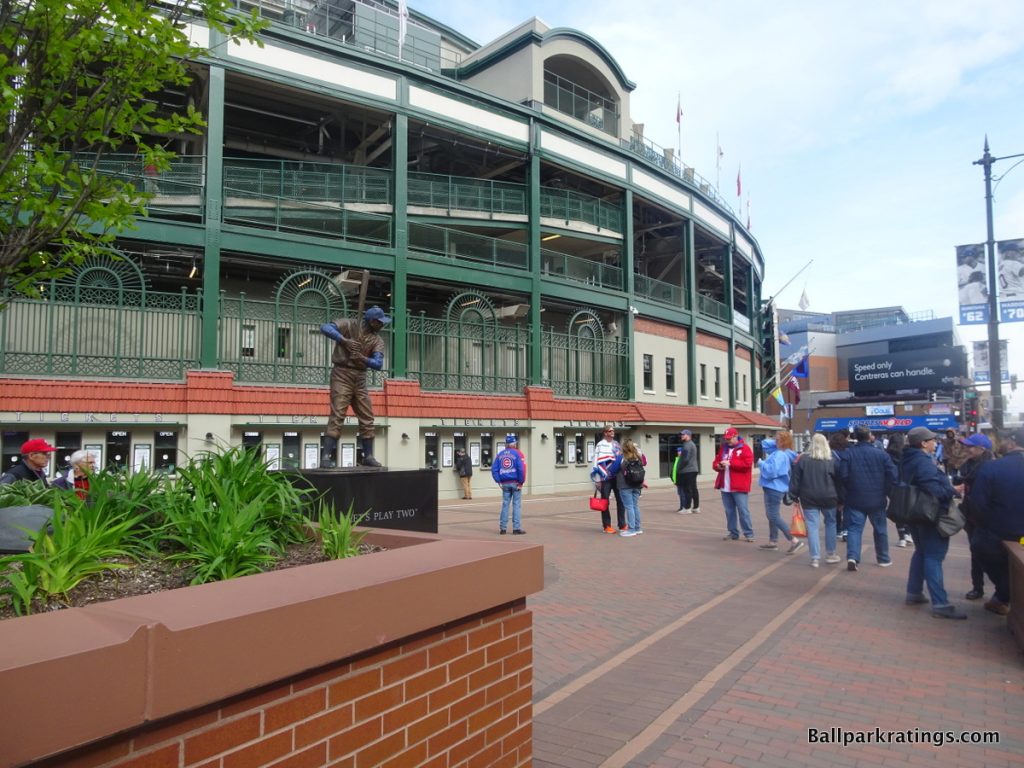
However, Wrigley Field’s greatest triumph is and always has been how well it fits in with the Wrigleyville neighborhood.
When walking east on W. Addison Street toward the home plate entrance, you don’t even see Wrigley Field until you reach the intersection on Clark Street, as the fit is so seamless the park just feels like another neighborhood structure. I cannot begin to describe the pleasure of this sensation, matched only by that of Fenway Park’s integration with its neighborhood environs.
Wrigley’s exterior architecture remains intimate and iconic, and the renovations have been in keeping with that simple splendor while greatly enhancing the raw aesthetic appeal.
9) Target Field (2010), Minnesota Twins: 7.5/10
Overall Ballpark Ranking: 5/27
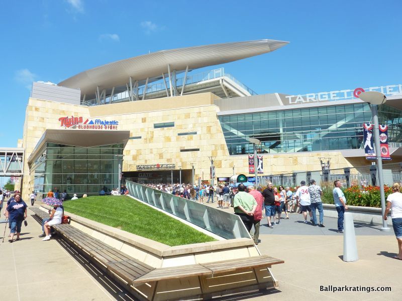
Despite its questionable architectural merits, Target Field’s limestone exterior facade certainly adds value to the derivative ballpark landscape.
Originating from Minnesota, the Twins incorporated local limestone as the exterior’s primary material, which is nicely accentuated by natural wood paneling. Apparently imported from Brazil, the wood is a nice touch and definitely brings something new to the table. There’s no mistaking the natural, Minnesota forest feel, in what might be the most recognizable exterior in the majors. I definitely appreciate the novelty and local inspiration here.
At the same time, Target Field represents some of Populous’s worst impulses, namely this awkward deconstructivist brand of postmodernism. It’s all a bit too much, trying too hard to be faux regional and modern, while compromising true architectural principles.
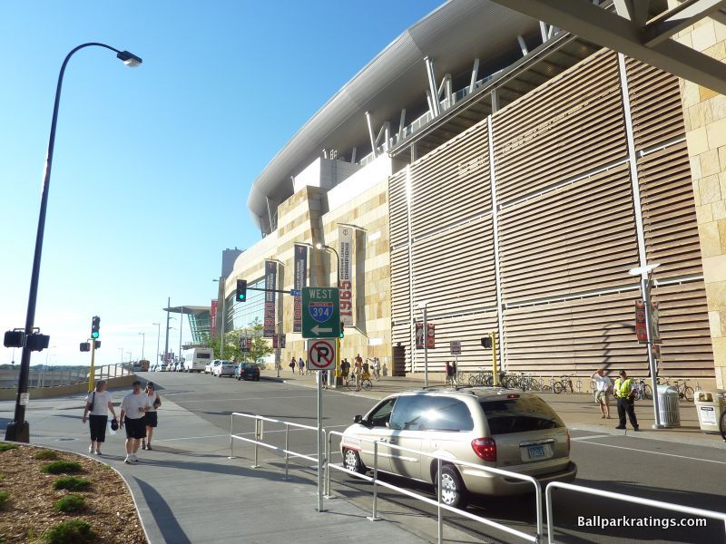
I’m not a big fan of the glass and steel structures jutting out from the limestone. The overuse of glass is a distinctively modern touch, but I don’t care for how it clashes with the limestone. It goes well with the attractive curves of the sculpted canopy roof, but the tangential lines of the glass structures don’t look very good extending out from the stonework.
Just based on gut aesthetic impressions, the variance of the limestone colors themselves are too jarring as well. Sure, it’s reasonably attractive, but I would have changed some minor aspects of the design.
Much of the landscaping around Target Plaza in right field, including the artwork and flowers, is simply fantastic. Pay special attention to the artistic wind veil on the parking garage. You can tell the Twins devoted a disproportionate amount of time giving the fans a memorable sense of arrival upon entering the plaza.
Overall, it’s a strong concept that perfectly captures the city and the region, successfully encapsulating a mix of cosmopolitan Minneapolis and natural Minnesota. The Twins tried something bold here, even if I only give it a B for pure aesthetic attractiveness.
After an array of derivative retro ballparks, it’s hard to go wrong with a novel use of natural materials that screams Minnesota, and many of the little touches are excellent.
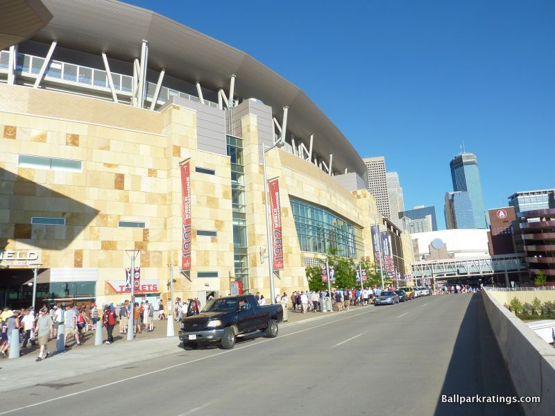
8) Progressive Field (1994), Cleveland Indians: 7.5/10
Overall Ballpark Ranking: 8/27
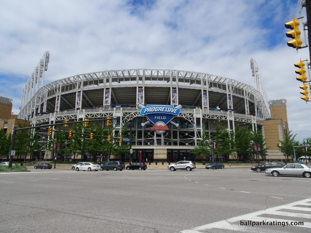
Progressive Field’s exterior design doesn’t get a lot of love for its aesthetics, but Cleveland was ahead of its time in constructing a ballpark that reflects the city.
Much like Target Field in Minneapolis, we have novel use of local materials and a well-articulated concept echoing the spirit of the region, but I give Progressive a bit of a boost for demonstrating a gutsy level of innovation for the time period.
After the revolutionary Camden Yards opened in 1992, clubs felt pressure to conform to the red brick aesthetic. As the only 1990s post-Camden park to not follow the red brick trend, Progressive Field was often criticized for being cold and industrial on the outside.
As the red brick retro movement continued to gain traction into the new millennium, people realized that many of the superficial elements of Progressive Field were in direct opposition to the template of the time.
But by the late-2000s, folks realized retro stopped being an innovation and became a lazy starting point for any club looking to construct a ballpark. These other clubs failed to consider that classic ballpark facades resonated because they fit in within the community. Throughout the 1990s and 2000s, many of these “attractions” were just thrown into the middle of nowhere. It represented a time where retro became a novelty rather than something authentic. Retro parks essentially became theme parks.
Progressive Field is not one of those, understanding that the best throwback parks craft something that fits with the urban fabric.
Despite a renewed sense to move away from the red brick, wrought iron formula, the wild success of Baltimore’s park has had an undeniable effect on most new parks to this day. For Cleveland to oppose that aesthetic directly after Camden opened took true vision, a vision rooted in authenticity.
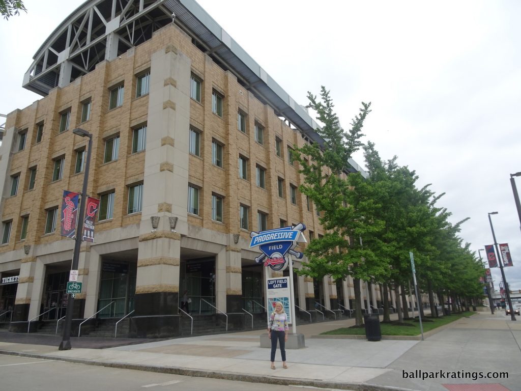
You may have heard that the white exposed steel look is meant to evoke Cleveland’s industrial values. But Progressive Field is not really a façade in any sense of the word. It’s a transparent statement of Cleveland. With no concrete and not much of a brick “façade” around home plate, guts are exposed, revealing bones, tendons, and “reality.” The steel grinders mimic many of the local bridges on the Cuyahoga River, while the light towers represent the town’s smokestacks.
The complementary elements work great here as well. Indiana limestone forms the most of the façades, while Pennsylvania buff-colored brick and Atlantic green granite completes the rest of the structures. The buff-colored brick and Atlantic green granite base are a nice change of pace and unique among ballparks. The silver light fixtures are worth noting as well.
The local use of materials is especially impressive for its time. While many of the recent ballparks try to use “local” and “natural” elements to gain LEED “green” certification, Progressive Field was a pioneer here, way ahead of its time. We don’t see another park use similar materials for another 7-10 years.
Despite the consensus that the exterior is not particularly good looking (not necessarily my opinion, I’ll take this over a generic retro clone), all of the elements work well together and contribute to the authentic feel of the ballpark. And the “guts” look contributes to the openness.
As a concept, it’s one of the best in baseball.
7) Oriole Park at Camden Yards (1992), Baltimore Orioles: 7.5/10
Overall Ballpark Ranking: 6/27
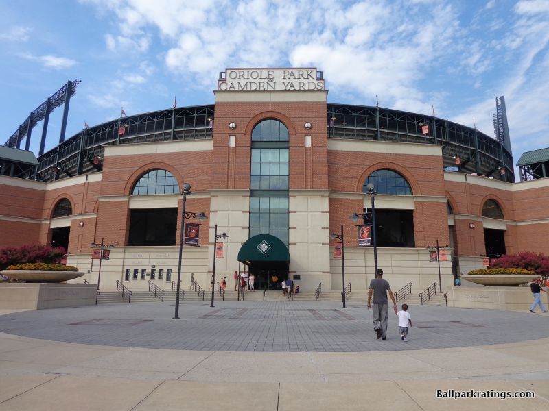
So much has been written and spoken about Camden Yards—its narrative is as mythic as its sweep—that it’s difficult to summarize its influence without reciting clichés that have already been digested by millions of baseball fans.
Despite later being eclipsed in nuance and style points, the warm simplicity of an exterior design featuring red bricks and arched windows reached its crescendo of praise with Camden Yards.
As the first retro park in the majors, the architects deserve credit for being trendsetters, but Camden Yards’ retro architecture continues to work into the 21st century because it fits with the spirit of Baltimore and the surrounding urban area, something successors just didn’t seem to grasp.
Being clairvoyantly aware of the potential for retro to become a self-conscious fake “Ye Olde” theme park in 1992 (unlike the indulgent Citi Field in 2009!), the Orioles built a remarkably intimate building in both style and substance.
Camden Yards mimics the spirit of Baltimore via the B & O Warehouse and the Inner Harbor, while bringing a number of lasting exterior innovations to the table. Groundbreaking by definition, the attractive exterior façade is supplemented by wonderful landscaping as well.
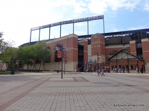
With the advent of the multi-tiered stadiums featuring luxury boxes and an upper deck, ramps and elevators became a functional necessity. Naturally, the easiest way to construct these ramps was to place them on the outside of the stadium, as the idea of integrating the ramps into the ballpark seemed pointless or was cost prohibitive. Engineers, not architects, did this work; so little character was added on the outside.
The new idea, of course, would be to have an attractive façade visible on the outside, unobstructed by the ugly concrete of cookie-cutter stadiums resembling nuclear power stations.
And then behold, Camden Yards: the first modern ballpark with an attractive façade, effectively tucking those pesky ramps behind the façade into the stadium’s interior (although it’s worth pointing out the Orioles’ Memorial Stadium partially did this). Work usually left to engineers, like elevator towers and exit ramps, were done by architects. This seems like no big deal today, as this has been seamlessly accomplished by nearly every ballpark since.
The exterior was also novel and attractive, characterized by brick masonry, exposed green steel, and an intimate scale. Camden Yards was also the first modern ballpark to be built below street level, allowing the ballpark profile to stay in scale with its surroundings.
The upper deck is also pushed forward (back looking from the façade), further reinforcing an intimate feel. While the steel trusses still bulge up and out more than we would wish, this allows the ballpark to resemble a two-story structure, a look we are very familiar with today in baseball.
The façade itself is downscaled, stripped of the self-conscious pomp and frills seen in later ballparks, while still retaining elements of unique attractiveness.
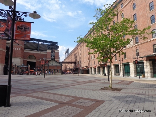
Walking around, you’ll note the façade is very horizontally segmented, especially around home plate, which further reduces the scale of the large ballpark. It’s meant to appear like it’s broken up into smaller structures. This effectively reduces the perceptual scale of the ballpark, in order to mimic the community surroundings including the warehouse.
Note how triangular roofing tops the stairwells on the sides. The bricks themselves are characterized by a consistent stream of horizontality as well, periodically interrupted by a vertical array of bricks topped with lighting resembling a baseball. Well done.
Of course, inspiring this gorgeous design is the classic B & O Warehouse. The eight-story, turn-of-the-century rail freight building is an essential part of the ballpark’s assemblage, acknowledging Baltimore’s bygone days as an industrial hub. Once called an ugly pile of bricks by columnists prior to construction, the warehouse now solidifies Camden Yards’ signature appeal.
Finally, the landscaping around the ballpark effectively supplements the wonderful old-fashioned design.
Purple spruce trees and orange flowers sprinkle the foreground of the footprint while flowers of the same colors lie at the base of the façade. The area in right field by the warehouse is attractively landscaped, highlighted by the ground bricks and “Time will not dim the glory of their deeds” monument from Memorial Stadium.
Once you add these venerable retro qualities to timelessly attractive design principles, and acknowledge the building’s innovations, you have one of the highest scoring exterior designs in the majors.
6) Marlins Park (2012), Miami Marlins: 8/10
Overall Ballpark Ranking: 15(t)/27
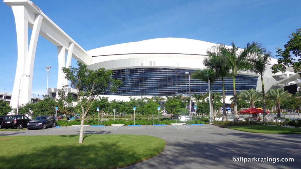
Now for a complete 180. As the only contemporary ballpark in Major League Baseball, Marlins Park’s exemplary exterior architecture is characterized by a cacophony of contradictions, stridently in opposition to the neighboring sensibilities to a jarring degree, but visually stunning and remarkably innovative when looked at alone.
Given such extremes, it’s worth restating what I consider when looking at an exterior design: (1) pure aesthetic attractiveness; (2) how well the architectural materials and overall treatment fit in with the surroundings; (3) structural innovation and novelty, specifically if the treatment was unique for its time, or if it was merely a formulaic rip-off; (4) the conceptual intentions on their own, as there are a few ballparks that are conceptually clever, but may not look that great.
Most parks are a least somewhat of a mixed bag, like maybe a double, single, strikeout, and a home run. Here, we’re looking at three grand slam home runs (1, 3-4) and a strikeout looking (2).
I’ll be exhaustive here, as baseball’s only contemporary ballpark deserves special attention. We’ll start with the negative first, because Marlins Park is more characterized by its grand slams.
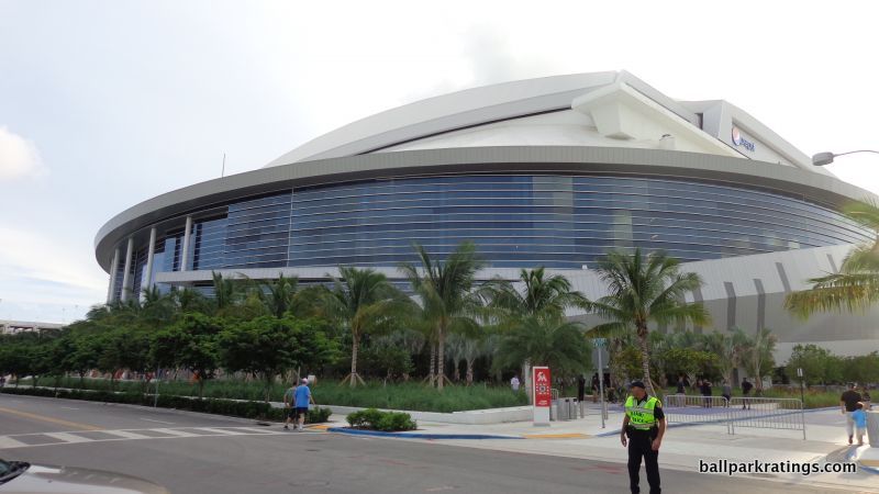
Marlins Park’s abysmal relationship with its site is so confounding it’s almost offensive. This building would be absolutely smashing if located in the city center, perfect in style with the gleaming glass skyscrapers of downtown and Brickell , and perfect in scope with the 21st century “Manhattanization” of the area.
Located in sleepy Little Havana, I’ve never seen a structure so obstinately opposed to the sensibility of the surrounding area in both style and scope. Marlins Park dwarfs, then proceeds to spatially overpower, the intimate Little Havana neighborhood, in what is the most contradictory site/structure relationship you can imagine.
Coors Field’s red brick exterior fits with that of LoDo in Denver. Progressive Field’s industrial white steel is meant to recall that of nearby bridges in Cleveland. PNC Park’s ochre Kasota limestone matches that of the North Shore context in Pittsburgh. Marlins Park may be “All about Miami,” but it doesn’t reflect the neighborhood. Not only does nothing about Marlins Park say Little Havana, the two are opposed in a starkly direct manner.
What’s more, this clashing sensibility is so noticeable that the Marlins took steps to reduce the perceptible contrast. They show awareness of this contradictory dynamic by meekly designing the parking garages with palm tree pastel tiles in order to connect the massive facility to its small-scale Little Havana environment. It’s intended to reduce the visual scale more gradually, serving as a bridge between the two. This is actually a thoughtful gesture, but it doesn’t solve the problem.
Anyway, this is something I really frown upon, but the structure’s merits are even more impressive than this shortcoming. There’s a lot to unpack here.
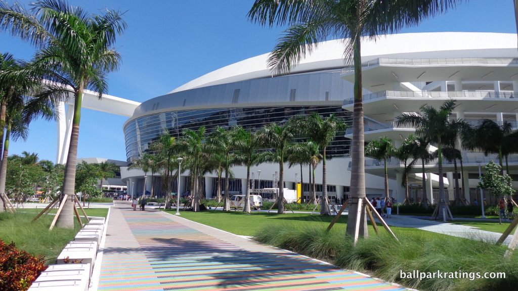
In case you haven’t noticed, Marlins Park isn’t retro. Not one brick. Not one stone. No exposed steel painted green. No Ebbets Field rotunda. This is indeed the starkest stylistic departure since Camden Yards, as 24 other ballparks since 1990 (including three renovated ones) feature at least one of these elements. Retro was so popular you even get hints of it at Tropicana Field (rotunda).
Marlins Park’s originality as “not retro” does give it an initial leg up. Considering the contemporary architecture, I should note from the outset that I don’t think the modern retractable roof takes away any of its appeal on the outside, unlike the retro roofed parks outlined above.
Marlins Park has been called a “neomodern” form of ballpark architecture, and I think that’s a good categorization. The building consists of an amalgam of deep blue glass, white stucco and steel, unadulterated concrete, and sparkling silver aluminum. It does perfectly reflect the contemporary nature of a city that never really embraced nostalgia in the 21st century.
First of all, this is one of only a handful of ballparks in baseball that can constitute “capital A architecture,” aspiring for something more resounding than the look of a suburban office park. Owner and art collector Jeffrey Loria was intimately involved in making Marlins Park. You do have to start with the building’s architectural intentions, which are already an accomplishment when you look at our derivative ballpark scene.
With its white stucco and graceful forms, Marlins Park conceptually captures sea merging with land, a spiritual kin to Brickell and Biscayne Bay downtown. It’s an abstract expression of Miami. Marlins Park’s lines and curves are dazzling, continually clashing then flowing in various rhythms, just like the Atlantic Ocean. Through it all, the fluidity of form is the main theme.
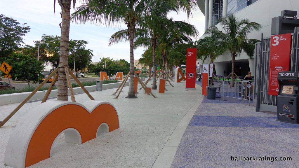
Near the east end of the park in the left field corner, we have the flowing simplicity of blue glass hugged by a draping aluminum veneer. Note how the aluminum veneer gradually points downward, meeting with the palm tree lined plaza littered with letters spelling out “Miami Orange Bowl.”
While it seems most fans enter in the left field corner, the west plaza is Marlins Park’s signature entry point, envisioned as a space for people to congregate before the game. As fans encounter this plaza, they meet the most explicit metaphors for Miami’s topography.
Note how the colored tiles alternate from green to blue below you, meant to represent grass and water. At eye level, the bottom cobalt sea blue glass represents the ocean. Above, the more orderly white stucco represents the land. The clashing aluminum lines going up and down (forming sharp “M”s and “W”s) the cobalt blue at eye level represent the waves of the “ocean” crashing against the “land” above. Finally, the vast horizontally flowing deep blue glass above it all represents the sky.
I particularly love the look of the north end (left side) of the west plaza, where the constant horizontal curving fluidity gets interrupted by a sharp, linear form protruding out of the main structure (this is actually behind home plate, but you can’t tell), emphasizing the unpredictability of the natural scene of land and water. The elliptical form generally eschews rigid angles, but this is an exception.
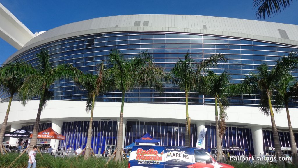
This is conceptually outstanding and visually breathtaking for any structure, much less a ballpark. It’s just such a delightful meeting of the most elemental natural forms, free from more elaborate gimmicks. The abstraction isn’t complicated.
Marlins Park is also free from more explicit gimmicks. You’ll note that other ballparks have various “regional accents” and ornamentations in order to distinguish their tired red brick facades. Ranging from bad to good, remember the “PHILADELPHIA” spelled out in bricks at Citizens Bank Park or the Michigan blue and orange pewabic tile punctuating the outside of Comerica Park.
You’ll note Marlins Park needs none of that. Marlins Park is pure architecture, and more conceptual than any ballpark ever built. At the same time, the concept is accessible.
While most retro parks want you to think they’re intimate, Marlins Park boldly makes no such illusions, as the towering structure is anchored by soaring columns holding up the retractable roof.
Daunting in proportion, these towering concrete columns are awesome. No post-1990 ballpark, with the possible exception of PNC Park (Pittsburgh), is actually intimate, so not only do I love Marlins Park’s appearance, but I love that it isn’t deceptive about any ostensible intimacy.
One of the most innovative exterior design elements is the ramp on the south end (right side) of the west plaza. It’s subtle, but these are unlike any other ramps in Major League Baseball. Instead of being circular or hidden behind the façade like most ballparks, these visible ramps are angled and cantilevered, forming a triangle, with the appearance of floating in mid-air. This has the same effect of the protruding structure on the left side of the west plaza discussed above.
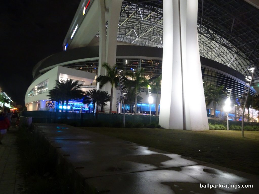
Finally, you may note everything we have discussed takes place in the east end of the ballpark behind left field (where the Orange Bowl letters are) or in the west end (main west plaza area which takes the lion’s share of the attention) ranging from home plate to first base. What about the north and south sides?
These areas are bordered by parking garages, again helping give the towering structure a sense of place. The spaces between the structure and the garages are designed as walkways intended to funnel fans to either the east or the west side.
In sum, Marlins Park has one of the best exteriors in baseball. Only parks with lovably intimate structure-setting connections top it. Fleshing all of this out in detail leads one to totally forget that principal flaw, similar to when you are there in person.
The conceptual cleverness and execution of Miami’s natural forms, the structural novelty and original use of materials, and the raw aesthetic attractiveness are all overwhelming.
5) PNC Park (2001), Pittsburgh Pirates: 8/10
Overall Ballpark Ranking: 3/27
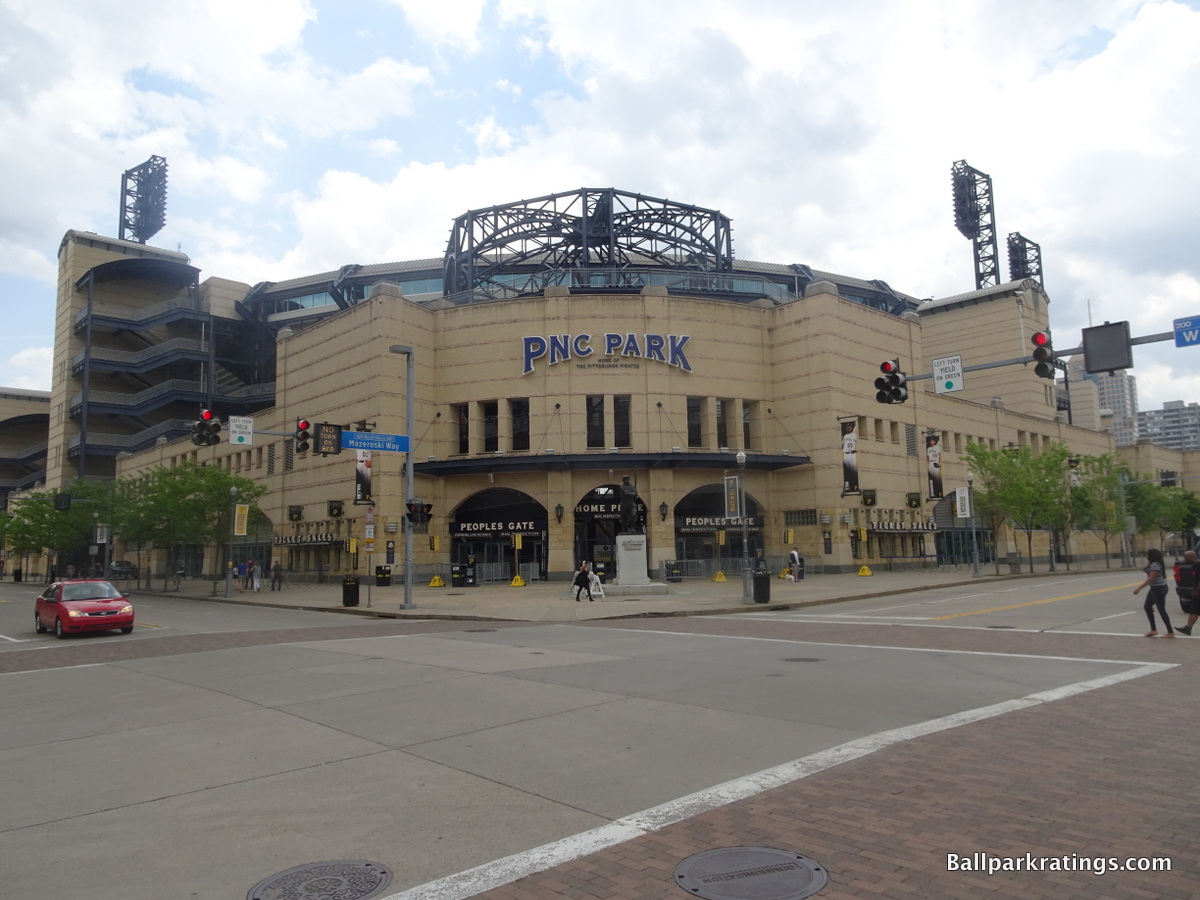
Continuing the welcome departure from the red brick aesthetic, the intimate PNC Park utilizes locally-inspired concepts, incorporates high-quality, regional materials reflecting the region and the neighborhood, and possesses a modicum of innovation.
In this respect, PNC Park’s architecture is similar to that of a Target Field or Progressive Field. But PNC Park gets a significant leg up because (a) the exterior treatment is so unequivocally gorgeous, and (b) the facade possesses an unseen level of intimacy for a new park due to the two-deck structure. At this point in the top 6, I could make an argument for any of these as my favorite.
At the most basic level, Pittsburgh’s limestone façade is one of the most attractive in baseball, but the true brilliance is in how everything about PNC Park reflects both the local landscape and the North Shore neighborhood.
PNC Park uses rugged materials from the area, including Kasota stone and ochre limestone. Forbes Field inspired the park’s light towers. While it mostly recalls North Shore’s 19th century buildings, there are subtle modern elements, such as the aluminum canopy by Federal Street. It’s a flavorful combination.
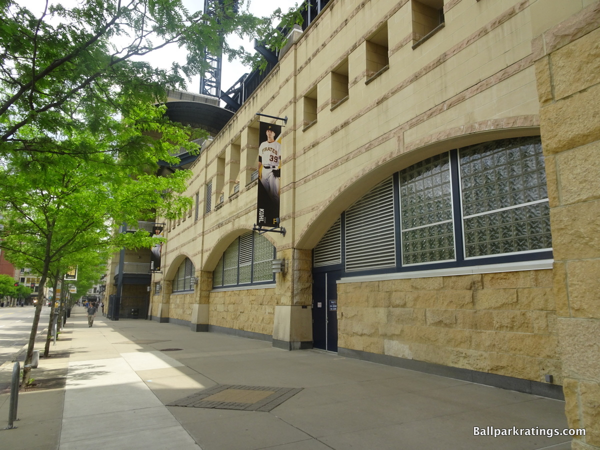
The color scheme really fits in with the ethos of the larger environment. Not only does the beige color mix well with its surrounding buildings on the North Shore, but it also reflects the skyscrapers across the river. The dark blue steel trusses mimic concept of the river as well.
The small size of the exterior façade significantly contributes to the ballpark’s main theme of providing the most intimate experience in baseball. While many newer ballparks strive for this look, PNC captures it best and takes the intimacy of the exterior to another level, one that even rivals Fenway or Wrigley.
Besides the basic aesthetic attractiveness, perfect contextual appreciation, and novel use of materials (for a ballpark, as always), the structure itself isn’t quite outstanding or nuanced if I had to nitpick.
It lacks many of the distinctive accents you might expect from something that has become an architectural monument, separated from the facades below. One other small caveat: I don’t really like the glassed-in press box at the top behind home plate. It looks like a space ship mixed in with limestone and clashes with the otherwise intimate sensibility.
But overall, PNC Park looks like a simple, attractive neighborhood park that fits in with the area, just as intended. It’s a tastefully downscaled effort in comparison to the mega ballparks of the era.
4) Fenway Park (1912), Boston Red Sox: N/A
Overall Ballpark Ranking: N/A
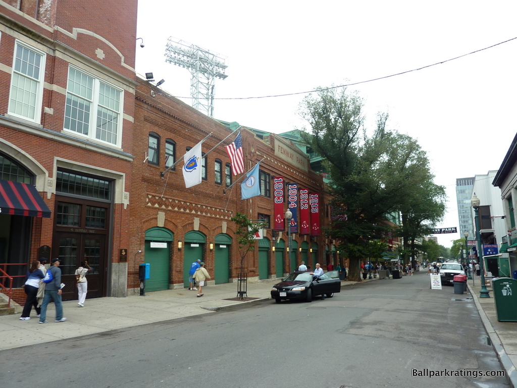
For a city whose architectural legacy has always been dedicated to preservation, never content to destroy the past for the newest fad like New York, it is fitting that Boston has Major League Baseball’s oldest ballpark.
In the late 90s, a new Fenway Park looked like a sure thing, but a tide of Red Sox fans rose against it, and old Fenway Park was protected and renovated. And thank god, because Fenway Park’s red brick façade is far superior to most of today’s streamlined retro mediocrity, which often lacks in detail, contextual appreciation, or any sense of appropriate scale.
True, Fenway Park never had the exterior grandiosity of a Shibe Park or Ebbets Field, two of the most highly acclaimed jewel box ballparks of their time. As Wrigley Field illustrated, it matters more how ballparks age, as Fenway wasn’t particularly highly lauded at the time.
Fenway’s exterior focus would not be defined by a palatial home plate grand entrance, but a modest façade on the third base side topped with an unembellished yet sedate nameplate. Complimented with white concrete and patterned accents, the red brick façade is aesthetically pleasing but not over-the-top, representative of understated New England architecture.
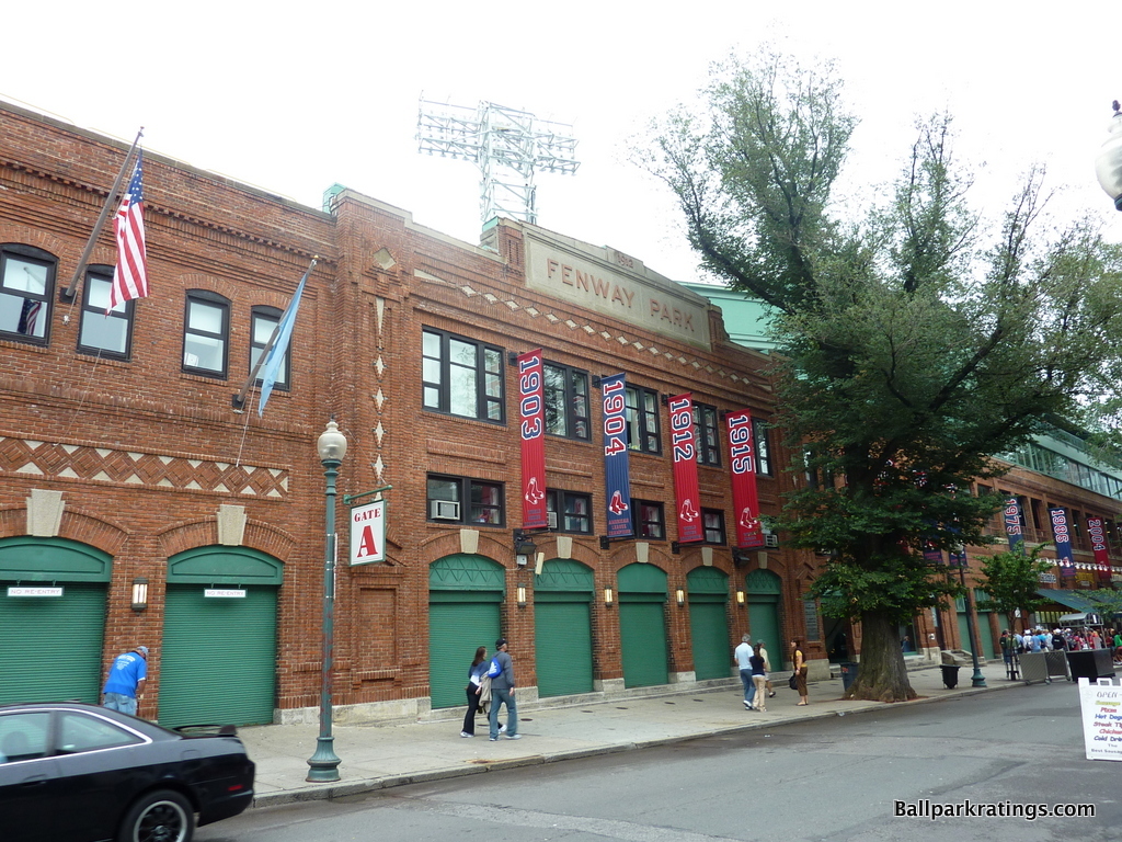
Dictated by the constraints of the urban site, not the whims of the P.R. department, Fenway Park’s exterior asymmetry is dazzling and authentic, as the red bricks and exposed green steel are assembled at different angles. Simply inimitable.
While the third base façade is the visual highlight, Fenway is so well structurally integrated into the neighborhood like Wrigley Field, as opposed to some of the new parks which overpower their surroundings.
When walking up to Fenway Park for the first time, you do a double-take, because it just looks like part of the neighborhood, not like some historical cathedral that overwhelms the area as one might imagine. With an intimacy on the outside that matches the inside, the brick looks as if it hasn’t been touched since the years of the Model T. Simply inimitable.
Like today’s classic parks with different superficial styles (Wrigley Field), or those built in different eras (Dodger Stadium), Fenway Park works by fitting in with its surroundings as if it’s one with the landscape. But I find Fenway Park’s exterior even more aesthetically attractive and architecturally distinctive than those two parks.
3) Globe Life Park in Arlington (1994), Texas Rangers: 8.5/10
Overall Ballpark Ranking: 19(t)/27
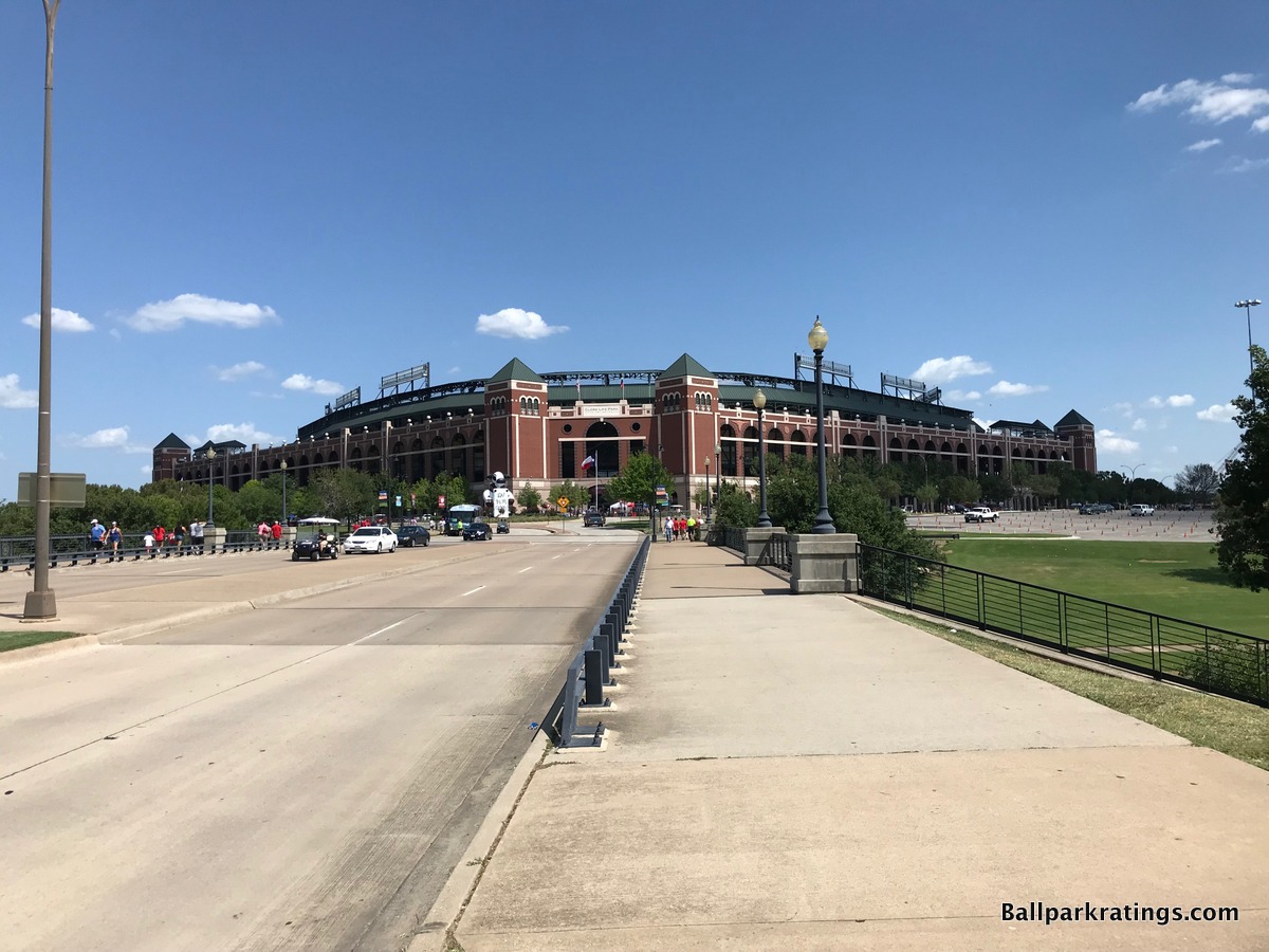
Globe Life Park in Arlington is an outlier at the top of our list, because it possesses that undesirable “faux-retro urban park in a suburban parking lot” sensibility, where the retro architecture and old-fashion treatment are not crafted around an urban or neighborhood context. In the vein of a Citi Field or a Citizens Bank Park, this is an urban-looking ballpark in suburbia longing for an urban setting, something I usually frown upon.
In fact, The Ballpark in Arlington is the prototypical “faux retro” suburban ballpark. Where design quirks and asymmetrical dimensions at Camden Yards (1992) and Progressive Field (1994) are a function of the site, all of the quirks, nooks, and crannies at The Ballpark in Arlington (1994) are synthetic, derived from the whims of the P.R department.
The Rangers’ ballpark spawned a generation of retro clones whose synthetically quirky dimensions and old-fashion elements felt forced and out of place, not in unison with its context like Camden Yards. There is no escaping the stage-set sensibility of this place, in what has always had a “retro theme park on an island” feel.
All of that being said, The Ballpark in Arlington is the one and only faux urban red brick retro ballpark where I grant a lot of leniency, because I just find it so well executed and attractive, with marvelous attention to detail.
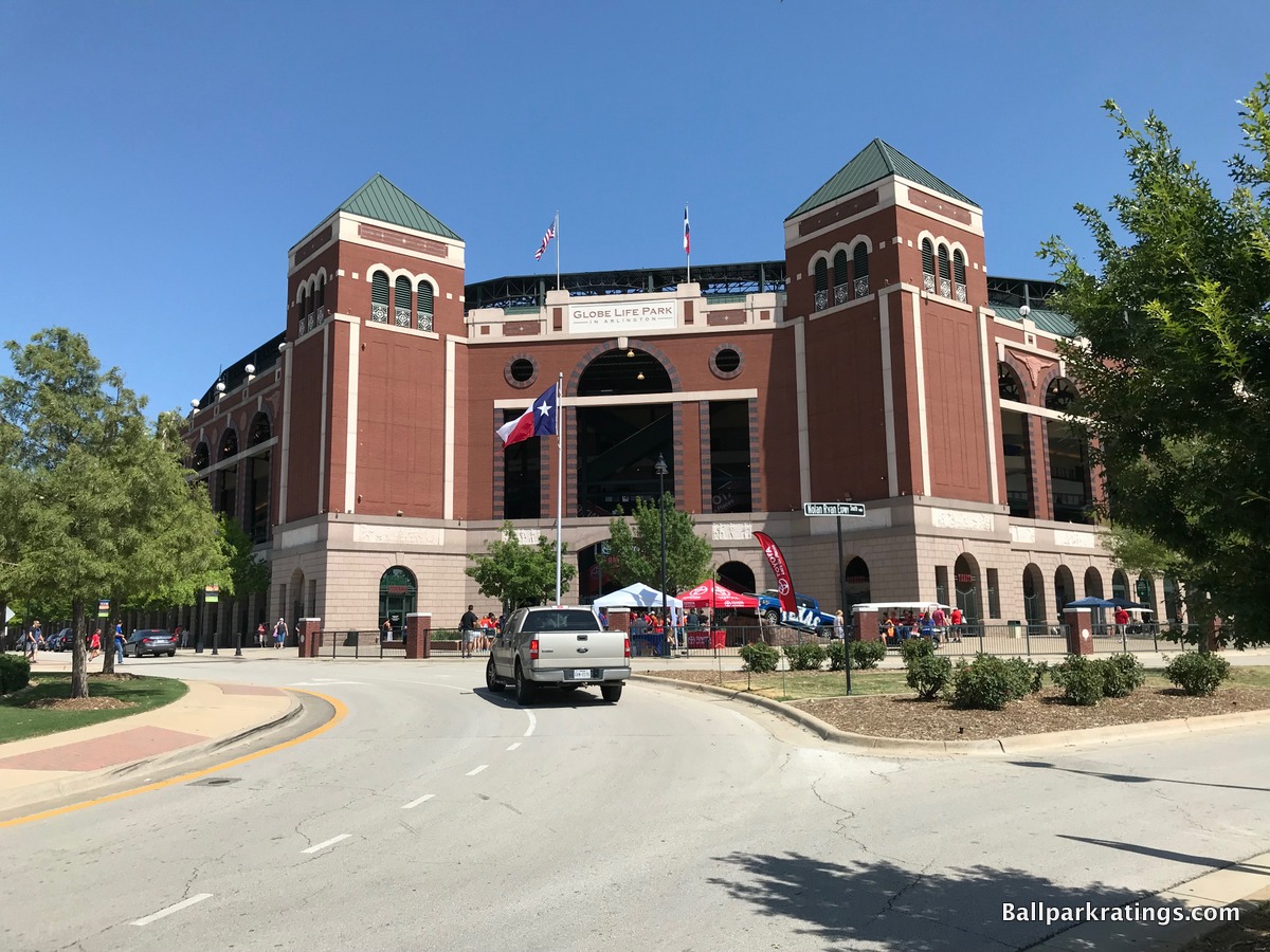
If only looking at the raw aesthetic attractiveness and regional touches on the façade, this is actually my favorite exterior in baseball.
Surrounded by a man-made lake, one of the first things you will notice is the uniformity of the structure, as all four sides have the same design. The monotony of the ballpark reinforces the imposing vision of the architectural design quite well. In a way, the remote location emphasizes a vast, sprawling “Texas” theme. This building wouldn’t have screamed modern urban Dallas. You know what state you’re in just by looking at it.
The sheer size of this imposing edifice, along with the engraved Lone Star pink granite and pointed green triangles, embodies neo-classical Texas architecture, fusing a contemporary local flare with the classic ethos of the underlying treatment.
The larger red brick archways sit on a smaller base of arcaded granite arches, brilliantly reducing the perceptual scale for fans, thus creating a sense of intimacy, while still maintaining the grandiosity of the structure. The arched windows are a nod to old Comiskey Park.
Also note how well the upper deck is sunken into the façade, to the point where all you see is green panels above the façade. Unlike many other parks, you don’t have that awkward upper deck springing upward on top of the facade. Take a look at the pictures of any of the other parks above, where the steel tresses and concrete upper desk encroach on the exterior design to an uncomfortable degree. Not in Arlington. The Rangers do the little things better than anyone else.
Speaking of little things, regional accents and local imagery punctuate Arlington’s red brick façade, in what is my favorite part of the design. The cattle heads, lone stars, and historic Texas bas-reliefs, depicting stories of the oil boom, the Alamo, and the cattle industries, are perfect final accentuates to an already epic structure. The attention to detail is remarkable, especially for a ballpark.
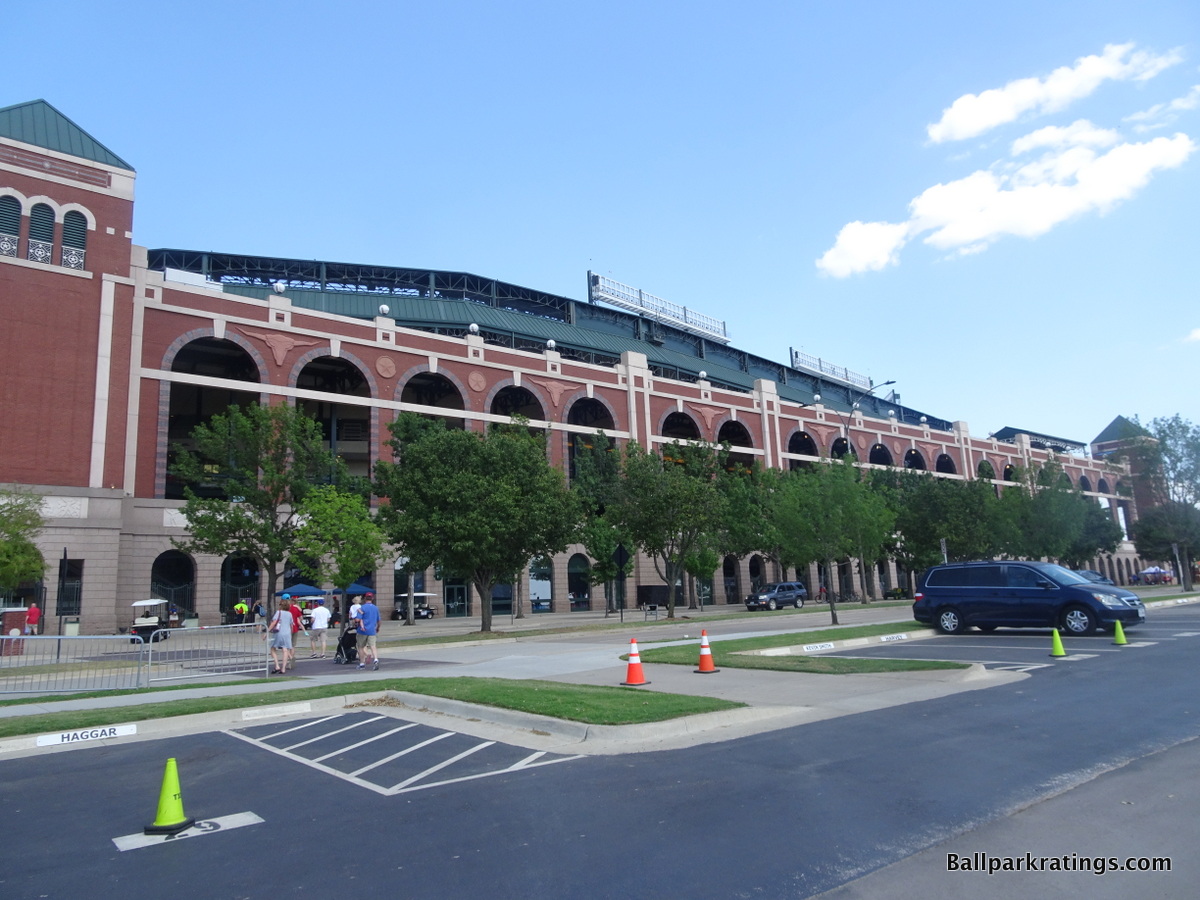
The Ballpark in Arlington’s picturesque lakeside location on a hill is the icing on the cake. You get why the Rangers wanted to nickname this place, “The Temple.”
Given the setting, I still can’t get over how much it ultimately comes off as a theme park, as the architects admitted that the structure takes elements from old Yankee Stadium, Fenway Park, Tiger Stadium, Ebbets Field, and old Comiskey Park.
It’s baseball’s version of Epcot at Disney World, where you visit the commercialized version of each country, similar to the Epcot format.
But the latter point underlines how The Ballpark in Arlington is ultimately a Texas building, just like Disney World is an American building. Because the design is infused with Texan elements, this is Texas’s take on Yankee Stadium, Fenway Park, Tiger Stadium, etc., akin to America’s take on the different countries. I just love that concept.
It may be contrived, but overall, this is one of the best concepts in the majors and the most attractive exterior scene overall, in my opinion. Out of all the soulless red brick facades without a context, we finally have one that works.
All of which makes it even more of a tragedy that this park will be replaced by a new retractable roof facility in 2020. The new Globe Life Field will be the first ballpark in modern history whose predecessor was demonstrably more attractive.
2) Petco Park (2004), San Diego Padres: 8.5/10
Overall Ballpark Ranking: 1/27
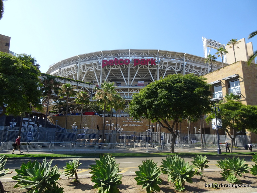
Despite some esoteric quibbles from an outside architectural perspective—as I said in the introduction, if you actually compare these ballparks to the best historic civic monuments, even some of the best fall short—Petco Park should be commended for being one of the only ballparks in baseball to constitute true “capital A” architecture.
The usual standard has all the flare of a suburban office park, but this transcends even the well-done retro ballparks, except #1 below.
At the very least, the effort is laudable. Couple that with the outstanding concept, novel use of materials, great contextual relationship, and raw aesthetic attractiveness, and Petco has one of the best exterior designs in baseball. It earns high marks across the board by my criteria.
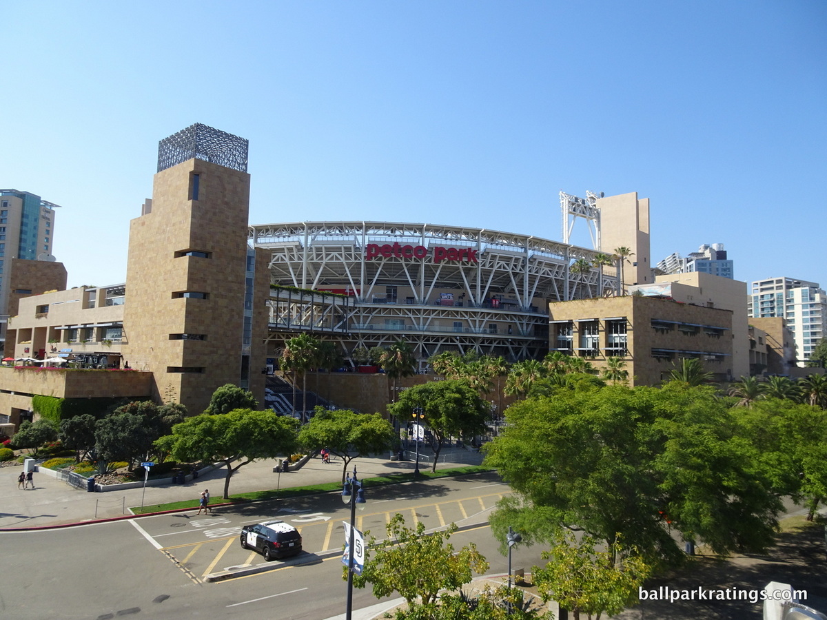
First off, Petco Park was the first to radically depart from the traditional idea of what a ballpark façade should look like, and I love that. It received criticism upon opening for not looking “like a ballpark,” but there is no overlooking Petco Park’s actual architectural merits.
Designed by Antoine Predock, the ballpark’s façade evokes a jagged postmodernism rooted in the Southwest. The rough blocks of sandstone, characterized by a rich ochre earth tonality, were imported from India. Sandstone marks much of the façade, with lighter stucco filling out some of the inner areas.
Natural, contextual tones are used: the sandstone and stucco mimic the cliffs of Torrey Pines in both color and texture, while the exposed steel cultivates a nautical marine motif. The slopes and edges of the garden buildings are reminiscent of the Mayan pyramids. The white railings and steelwork recall the ships in the nearby San Diego Bay, and the subtle hues of blue represent the water. Note the plush greenery and flowers cascading down the sandstone.
A perfect visual entry point, the home plate plaza area features a gorgeous waterfall, cascading over sandstone. The exterior is both conceptually groundbreaking and strikingly attractive, all while capturing the spirit of San Diego.
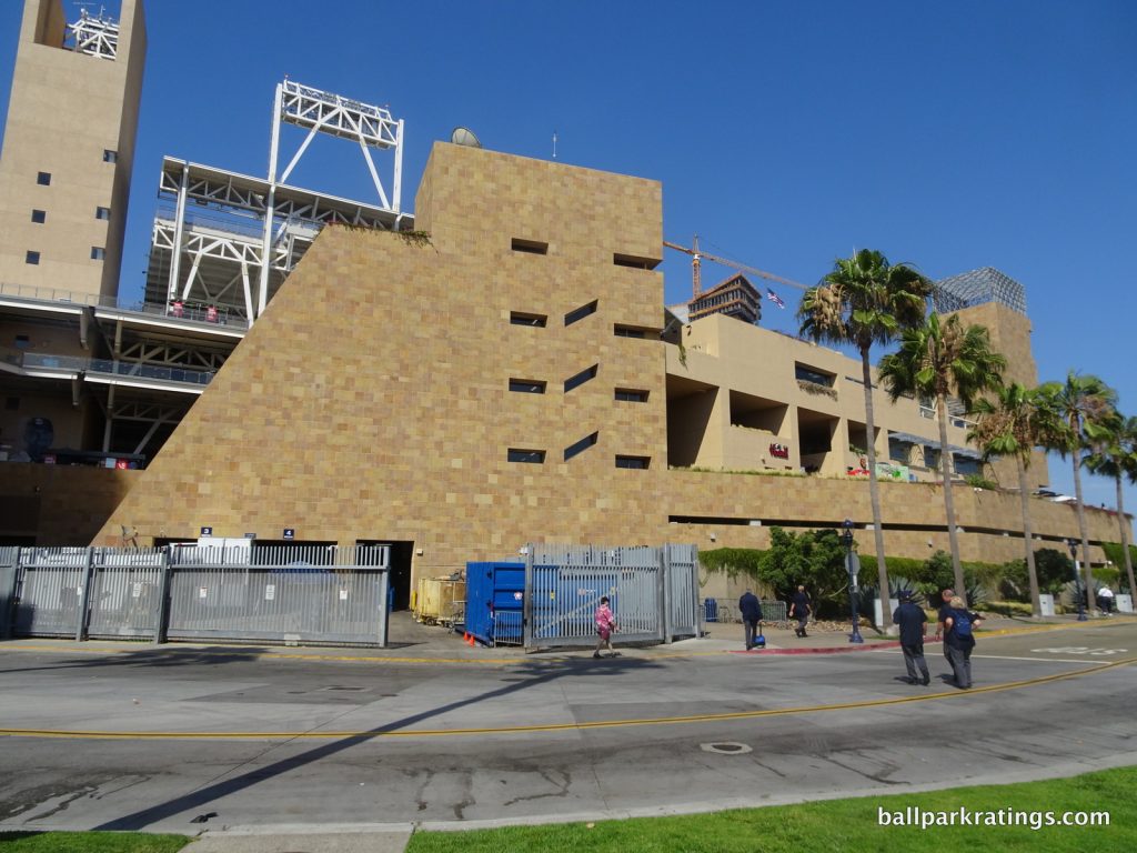
At night, the landscaped beams and concourses are lit in soft beige and blue making the exterior a sight to behold. The vibrant landscaping around the ballpark is superb. The Padres should be commended for striving to create an authentic sense of place, instead of following the nostalgia aesthetic like sheep.
Reflective of San Diego and forward-looking in its architectural lines, Petco Park is another superb park in the abstract, but it’s just as attractive. For all the talk about “elevated architectural concepts,” the Padres’ park is accessible in practice too. My sole complaint is the tension between the red brick Western Metal Supply Co. building in left field and the rest of the ballpark’s architecture.
From an architectural perspective, Petco doesn’t get as much attention as it should, as it’s right in the conversation for baseball’s best exterior design.
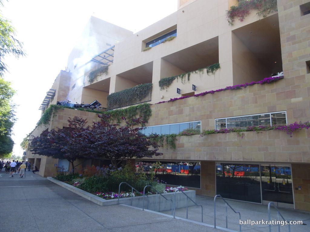
1) Coors Field (1995), Colorado Rockies: 8.5/10
Overall Ballpark Ranking: 7/27
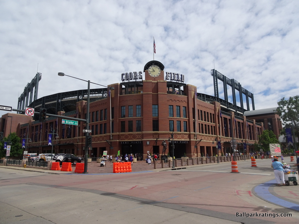
After Camden Yards kicked off the retro era in 1992, you saw subsequent retro ballparks splinter into two distinct strands from an exterior architectural standpoint, generally speaking:
- (a) Piggy backing off of Camden Yards, retro itself, not the individual design, was continually billed as the novelty, with little attention to detail and/or little appreciation of the ballpark’s context. We saw that throughout this list, and we even saw it as late as 2017 with the Braves’ SunTrust Park.
- (b) Understanding the true inspiration of Camden Yards, architecture should reflect the region and fit in with the local fabric, while utilizing superior materials regardless of the superficial style chosen.
Despite opening in 1995, Coors Field still represents the peak of (b), constructing an edifice with high-quality materials, thoughtful regional accents, and requisite scaling, all while fitting in with the neighborhood and the larger civic ethos more than any other post-1990 ballpark on this list.
Coors Field also utilized retro architecture when it was appropriate for the time period and pioneered multiple throwback staples that were copied by subsequent parks.
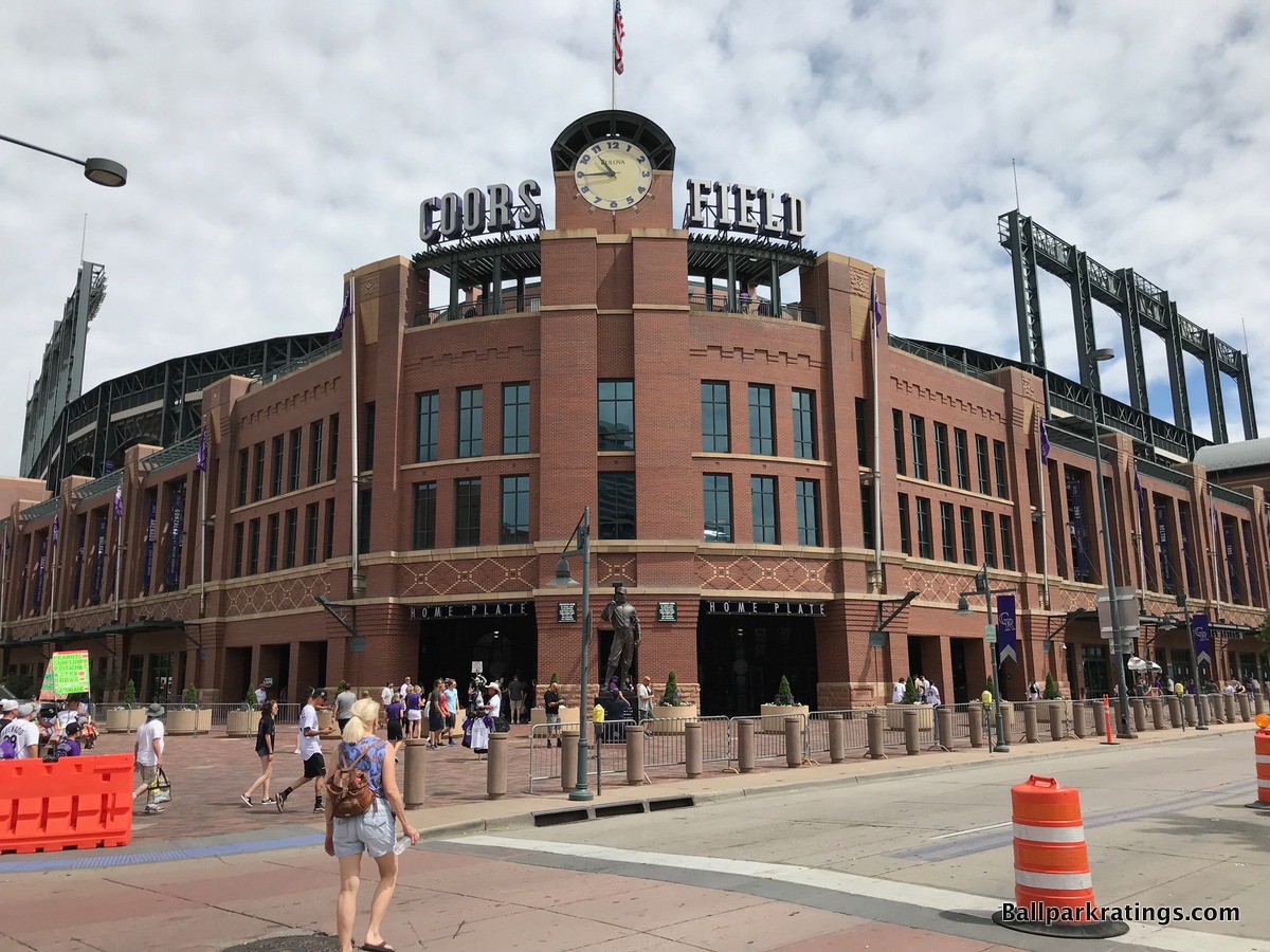
Coors combines some of the raw architectural attractiveness of a place like The Ballpark of Arlington with the savviest contextual inspiration and application.
First off, Coors Field was the first and remains only one of a handful of red brick designs to take the retro aesthetic one step further, adding regional accents and distinctive design cues from the area. At Camden Yards, retro was still the novelty, but Coors Field fuses that with local aesthetics to create a “capital A” architectural monument.
Red brick, sandstone, and ornamental terra cotta columbines are added in perfect proportion, creating a design with a distinctive southwestern rhythm. The masonry is simply phenomenal.
Pilasters are faced with brick laid in a stepped pattern, while the masonry below the rectangular windows is designed in a “diaper pattern,” which refers to the beige diamonds along the façade in a diagonal shape. There are three types of brick used here: red, buff-colored, and black. Also note the Native American-influenced carvings above the rectangular windows, further enhancing the southwestern sensibility.
The façade is supported by bases of natural Lyons sandstone, which was quarried near Boulder and Fort Collins. Terra cotta tiles also carve Colorado’s state flowers on the grounds outside the façade. Colorado’s state flower is also seen on some of the upper towers of the façade. All of this involves superb attention to detail for a ballpark.
Coors Field was also the first of multiple retro ballparks to have an old-fashion clocktower behind home plate, in what marks the iconic signature entrance to baseball’s best exterior design. It was also the first of many retro ballparks to emulate Ebbets Field’s home plate rotunda.
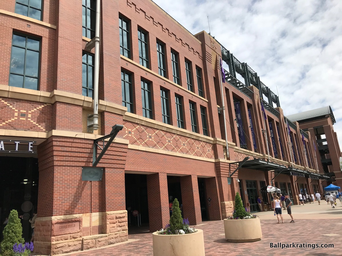
You may note that Coors Field eschews the use of archways in its traditional architecture, as team officials thought classic rectangular windows were in better keeping with Denver’s Lower Downtown environment. I agree. If I had to nitpick, I wish the Rockies had extended the rectangular windows behind home plate to the sides of the facade. The appearance down the lines is loosely similar to that of the rotunda, but it looks comparatively unadorned.
Considering the large size of the ballpark, the ballpark’s recessed exterior landscaping might be its greatest asset, as the outside of Coors Field is built on an extremely intimate scale, more so than other “intimate” ballparks. Partially due to the clocktower rotunda, the steel tresses and concrete upper desk don’t encroach on the exterior scene, unlike some other parks where those structures awkwardly spring out from the façade.
All of these touches, along with subtle wintergreen tree landscaping around the exterior, make Coors Field one of the few parks of its era with an unmistakable retro red brick façade.
Looked at alone, this would be a top-tier exterior design, but Coors Field’s connection to the Lower Downtown setting is its pièce de résistance. We’ve talked a lot about ballpark architecture fitting in with its surroundings, but other than the venerable Wrigley Field and Fenway Park, Coors Field does it best, simply brilliant in its integration with the urban fabric on the outside.
Perhaps unlike any modern-day ballpark built before, or since for that matter, the architects focused on building a structure in symbiosis with the surrounding context. Like when you walk up to Wrigley and Fenway, Coors looks like its been there for 100 years, because the architecture so strongly matches that of the surrounding warehouse buildings. Retro was clearly the right choice for this urban setting and the broader spirit of the city.
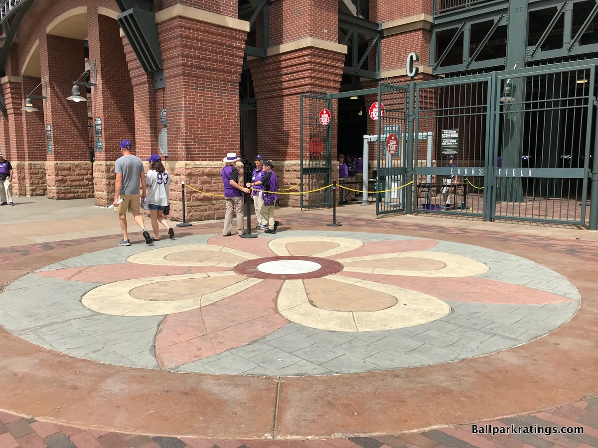
Coors Field has been largely credited with revitalizing the warehouse district, highlighted by the nearby old union station. Adorned with the same red brick of the ballpark, LoDo reminds one of a quaint western downtown.
The darker, almost clay colored red brick at Coors works extremely well, exuding a certain rustic neighborhood warmth that could only be associated with LoDo. The sunken exterior landscaping aids the ballpark’s fit with LoDo as well.
In sum, Coors Field earns the #1 spot in our analysis of MLB exterior architecture due to the use of higher quality materials, unique southwestern accents, plenty of regional touches, superior scaling through intimate exterior landscaping, excellent sense of place, and masterful integration with the neighborhood.
Nearly 25 year later, Coors Field shows that “retro” need not be blasé at any time in history, as long as a ballpark is constructed using tried and true architectural principles with a proper appreciation of the site.